Sometimes we have designs which are not possible using the Framework or Material Components widgets as-is. While we can subclass those widgets to adapt them, there can sometimes be some hidden pitfalls along the way. In this article, we’ll examine such a case and see how careful use of the available tools can simplify our task.

Previously we saw how it was relatively straightforward to draw and animate a selection indicator dot in a custom BottomNavigationView. However, adding a cradle around the dot caused us a couple of issues. The first was that it was difficult to see the cradle because it matched the background colour of the view above the BottomNavigationView. The second was that when we selected an item, the ripple did not fill the cradle. Although these issues seem separate, there is actually a common cause.
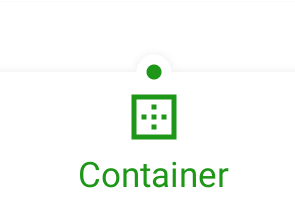
Let’s first consider the separation from the background. This is not a problem with the BottomNavigationView itself because we can see a shadow separating it from the view above:

But where the cradle sits, we just see a break in the shadow. If we added the shadow to the cradle, then we would see the cradle more clearly. All Android Views have an Outline. Sometimes this Outline implicitly matches the view bounds, and that is precisely what is happening here. So to render the shadow on the cradle we need a custom Outline.
The ripple behaviour is also reliant upon the view Outline. Once again, if we have a custom outline which includes the cradle, then we’ll get the correct behaviour.
Getting Into Shape
While we could create a custom ViewOutlineProvider and apply it to the view, there’s actually a simpler way: Use a custom MaterialShape. MaterialShapeDrawable is also capable of providing an outline. So if we create a MaterialShape which matches the cradle then we’ll get the outline that we require. Moreover, the cradle will become part of the view background drawable, so we’ll no longer need to draw it ourselves in onDraw().
Let’s start by updating the setters which control the size, shape, and position of the dot:
class ShapedBottomNavigationView @JvmOverloads constructor(
    context: Context,
    attrs: AttributeSet? = null,
    defStyleAttr: Int = R.attr.dottedBottomNavigationViewStyle
) : BottomNavigationView(context, attrs, defStyleAttr) {

    private val dotPaint = Paint().apply {
        style = Paint.Style.FILL
        isAntiAlias = true
    }

    private var topEdge: ShapedBottomNavigationEdgeTreatment? = null
    private var dotAnimator: Animator? = null

    private var onItemSelectedListener: OnNavigationItemSelectedListener? = null

    var dotDiameter: Float = 0f
        set(value) {
            field = value
            invalidateShape()
        }

    var dotPadding: Float = 0f
        set(value) {
            field = value
            invalidateShape()
        }

    var dotColor: Int = Color.BLACK
        set(value) {
            field = value
            dotPaint.color = value
            invalidate()
        }

    private var dotPosition: Float = 0f
        set(value) {
            field = value
            topEdge?.also {
                it.horizontalOffset = value
                invalidateOutline()
                invalidate()
            }
        }

    var dotAnimationDuration: Long = 0L
    .
    .
    .
}
We’ll look at topEdge in a moment. For now let’s concentrate on the setters. Anything which affects the size and shape of the dot will call invalidateShape(). Whereas changing the position of the dot will call invalidateOutline(). The dotPosition var will be animated, so this will be called repeatedly during the animation of the dot.
The invalidateShape() method looks like this:
    private fun invalidateShape() {
        topEdge =
            ShapedBottomNavigationEdgeTreatment(dotDiameter / 2f, dotPadding).also { newTopEdge ->
                background = MaterialShapeDrawable(
                    ShapeAppearanceModel.builder()
                        .setTopEdge(newTopEdge)
                        .build()
                ).apply {
                    fillColor = getBackgroundColor()
                    (background as? MaterialShapeDrawable)?.also { old ->
                        tintList = old.tintList
                    }
                }
            }
        invalidateOutline()
    }

    private fun getBackgroundColour(): ColorStateList =
        background.let {
            when (it) {
                is ColorDrawable -> ColorStateList.valueOf(it.color)
                is ColorStateList -> it
                is MaterialShapeDrawable ->
                    it.fillColor ?: ColorStateList.valueOf(getThemeColor(R.attr.colorSurface))
                else -> ColorStateList.valueOf(getThemeColor(R.attr.colorSurface))
            }
        }
This is where we use the topEdge var that we saw earlier. This is what we’ll use to create the cradle shape at the correct location in the top edge of the BottomNavigationView‘s background. We create a new MaterialShapeDrawable using this custom top edge treatment and set the background of the BottomNavigationView to this.
We then match the background colour to the existing background colour. The getBackgroundColour() method will do this for various variations of the current background. This will usually be a MaterialShapeDrawable but it never hurts to allow for the unexpected. If all else fails we’ll obtain the value of colorSurface from the current theme.
Before returning invalidateShape() call the same invalidateOutline() method that we called earlier. This is actually a method of View. It is similar to View‘s invalidate() method, except it indicates that the Outline has changed and needs to be redrawn.
Custom Top Edge
Let’s now look at the custom edge treatment that creates the cradle shape. This is only applied to the top edge of the BottomNavigationView because that is where the dot and its cradle are positioned.
internal class ShapedBottomNavigationEdgeTreatment(
    private val dotRadius: Float,
    dotPadding: Float
) : EdgeTreatment() {

    var horizontalOffset: Float = 0f

    private val radius = dotPadding + dotRadius * 2f

    override fun getEdgePath(
        length: Float,
        center: Float,
        interpolation: Float,
        shapePath: ShapePath
    ) {
        if (dotRadius == 0f) {
            shapePath.lineTo(length, 0f)
        } else {
            shapePath.buildCradle(length, interpolation)
        }
    }

    private fun ShapePath.buildCradle(length: Float, interpolation: Float) {
        val leftPosition = (horizontalOffset - radius) * interpolation
        val rightPosition = (horizontalOffset + radius) * interpolation
        lineTo(leftPosition, 0f)
        addArc(leftPosition, -radius, rightPosition, radius, START, SWEEP)
        lineTo(length, 0f)
    }

    private companion object {
        private const val START = 180f
        private const val SWEEP = 180f
    }
}
This takes two constructor arguments for the which are the size of the dot itself, and the padding around it. The size of the cradle will be a combination of these. A new instance of ShapedBottomNavigationEdgeTreatment will need to be created whenever these change.
When the Outline of the View is invalidated, the getEdgePath() method will be called to return the shapePath which represents the edge. Previously we’ve looked at the rules for creating custom corner treatments, which also explains how to draw arcs. So I won’t go into a highly detailed description here.
The important thing is that the length argument will be the total length of the edge, and the center argument will be the location at which the dot will be rendered. This is actually badly named because it will not necessarily be in the centre of the edge, but this argument name is defined by EdgeTreatment. center will be set to the value of dotPosition in ShapedBottomNavigationView. So center will actually be the dot position.
If the radius is 0 we save a few unnecessary arithmetic operations by drawing a straight line for the entire length of the edge. But if it is non-zero we draw the cradle at the dot position.
We first calculate the start and end positions of the cradle. We then draw a straight line from the left end of the edge to the left edge of the cradle. Next, we draw a 180º clockwise arc from the left position to the right position. This is the cradle itself. Finally, we draw a straight line from the right edge of the cradle to the right end of the edge.
The Result
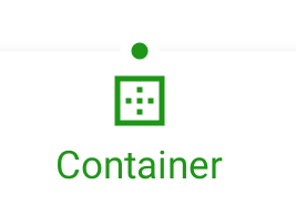
With this now in place we get a shadow around the cradle, and also our ripple covers the cradle as well:

The cradle and dot animate together thanks to the cradle and dot positions both being driven from the dotPosition var.
Conclusion
We got there in the end! When dealing with issues such as this it is important to understand how the Android framework actually does things. In this case, it uses the view Outline to determine both the shadow and the ripple clipping. Using a MaterialShapeDrawable as the background for a view will allow us to control this Outline.
The source code for this article is available here. This sample source is built from the source for the previous series on Material Motion. That already had a BottomNavigationView implemented so it provided a ready-made foundation for this source.
© 2020, Mark Allison. All rights reserved.
Copyright © 2020 Styling Android. All Rights Reserved.
Information about how to reuse or republish this work may be available at http://blog.stylingandroid.com/license-information.

