
One of the foundations of Material Design 2.0 is the ability to define shapes to reinforce the branding being applied to our apps. At first glance what we are able to control appears to be somewhat limited, but in this series we’ll go deeper down the rabbit hole to explore some of the more subtle things that we can do with material shape.

The final thing that we’ll look at in this series is how we can create custom corner and edge treatments. We’ll focus on a custom corner treatment in this article as that is the more common use-case, but it is possible to create custom edge treatments as well.
A CornerTreatment is responsible for returning a ShapePath (which is similar to a standard Path that you might use with Canvas) which defines the corner shape. We define the corner shape for the top left corner and ShapeAppearanceModel.Builder() will perform the necessary rotation and angle adjustments and for each of the corners to which it is applied. For this example we’ll construct a concave rounded corner like this:

Before we continue it is worth pointing out this this is quite a harsh shape because of the sharp angles where the corner curve diverges from the edges. While it is quite striking, if we were to overuse a spiky shape like this within our app it likely to have a negative effect on our users. So discretion is required here!
To understand how to create a custom CornerTreatment let’s first take a look at the RoundedCornerTreatment that is included in the Material Components library:
/*
 * Copyright 2017 The Android Open Source Project
 *
 * Licensed under the Apache License, Version 2.0 (the "License");
 * you may not use this file except in compliance with the License.
 * You may obtain a copy of the License at
 *
 *     http://www.apache.org/licenses/LICENSE-2.0
 *
 * Unless required by applicable law or agreed to in writing, software
 * distributed under the License is distributed on an "AS IS" BASIS,
 * WITHOUT WARRANTIES OR CONDITIONS OF ANY KIND, either express or implied.
 * See the License for the specific language governing permissions and
 * limitations under the License.
 */

package com.google.android.material.shape;

import androidx.annotation.NonNull;

/** A corner treatment which rounds a corner of a shape. */
public class RoundedCornerTreatment extends CornerTreatment {

  float radius = -1;

  public RoundedCornerTreatment() {}

  /**
   * Instantiates a rounded corner treatment.
   *
   * @param radius the radius, in pixels, of the rounded corner, which is rendered as a quarter
   *     circle.
   * @deprecated Set the size using the {@link ShapeAppearanceModel.Builder}
   */
  @Deprecated
  public RoundedCornerTreatment(float radius) {
    this.radius = radius;
  }

  @Override
  public void getCornerPath(
      @NonNull ShapePath shapePath, float angle, float interpolation, float radius) {
    shapePath.reset(0, radius * interpolation, ShapePath.ANGLE_LEFT, 180 - angle);
    shapePath.addArc(0, 0, 2 * radius * interpolation, 2 * radius * interpolation, 180, angle);
  }
}
All of the work is done in the highlighted getCornerPath() method which is only two lines, but requires a little bit of explanation. The shapePath argument is the path to which we must write the corner shape; The angle argument represents the angle of the corner – this will typically be 90º; The interpolation value is used in animating corners and its value ranges from 0.0 – 1.0 where 0.0 will have no effect (i.e. a square corner), and 1.0 will have the full corner shape applied. For the purposes of this explanation we’ll ignore this – but assume that it is of value 1.0 when drawing the full corner. The radius is is size of the corner.
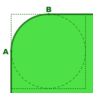
Let’s first take a look at the precisely what the responsibility of a CornerTreatment is. Consider this:
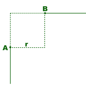
The two solid lines on the left and top edges are those created by the EdgeTreatment and the CornerTreatment is responsible for creating a ShapePath which connects point A (the end of the left edge) to point B (the start of the top edge). The dotted area represents the bounds of the corner with a given radius of r which is the value passed in to getCornerPath() in the radius argument.
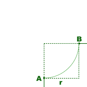
The first line of getCornerPath() resets the ShapePath and sets the current location to point A. The origin coordinate space that we’re working in is at the point where the two edges would intersect – the top left corner of the dotted area, and the positive values will be to the left of and below this point. So the first two arguments to the shapePath.reset() method will be 0, r which corresponds to point A. The remaining two arguments to this method control the orientation of the shadow generation, and we’ll just copy this when we come to implement our custom CornerTreatment.
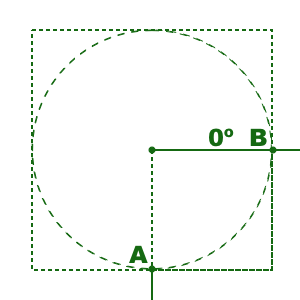
The second line of getCornerPath() creates the arc of the corner using the shapePath.addArc() method. It is similar to Path#addArc() but, for those unfamiliar with that method a little explanation is required. An arc is a part of the outline of a given circle. The first four argument represent the left, top, right, and bottom edges of the rectangle which bounds the circle from which the arc will be created:
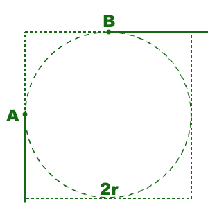
In our case, the top left is 0,0 and the right and bottom of the circle are twice the radius 2r, 2r. The arc will be the section of the dotted circle which fils this rectangle which passes from point A to point B in a clockwise direction. The remaining two arguments define this section. The startAngle is an offset from 0º which runs horizontally and to the right of the centre point:
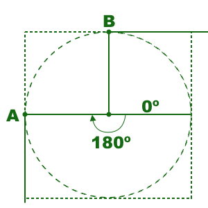
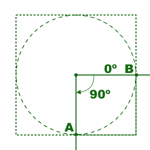
We need to start drawing at point A so and angle of 180º is used as the start angle. Positive angles represent clockwise rotation and negative angles represent anti-clockwise rotation.
The final sweepAngle argument represents the angle through which to create the arc. This comes from the angle argument that is passed in to the getCornerPath() method which, as already discussed, will usually be 90º :
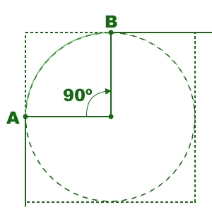
This will create the arc running from point A to point B:
It is important that this path actually joins point A to point B because unless the entire shape is a closed path it will not behave correctly when it comes to rendering a filled version of the shape.
So now that we understand the basics of how the RoundedCornerTreatment works, let’s create our own to create a concave version of this:
class ConcaveRoundedCornerTreatment : CornerTreatment() {

    override fun getCornerPath(
        shapePath: ShapePath,
        angle: Float,
        interpolation: Float,
        radius: Float
    ) {
        val interpolatedRadius = radius * interpolation
        shapePath.reset(0f, interpolatedRadius, ANGLE_LEFT, ANGLE_LEFT - angle)
        shapePath.addArc(
            -interpolatedRadius,
            -interpolatedRadius,
            interpolatedRadius,
            interpolatedRadius,
            ANGLE_BOTTOM,
            -angle
        )
    }

    companion object {
        const val ANGLE_LEFT = 180f
        const val ANGLE_BOTTOM = 90f
    }
}
This is actually pretty similar to RoundedCornerTreatment except that I’ve written this in Kotlin, and the values used as arguments to shapePath.reset() are as before – to start drawing at position A – but those for shapePath.addArc() are a little different. Once again let’s go through this step by step. The points A and B will be the same as before, but the arc is a bit different:
The circle from which this arc is obtained has different bounds to the previous one:
The centre of this circle is actually point 0,0 so the left and top edges are both -radius offset (i.e outside the corner bounds), while the right and bottom edges are radius offset. The first four arguments of shapePath.addArc() reflect this.
Although it might appear that we do not need a startAngle because point B appears on the 0º edge of the circle, we must start the arc from point A and finish at point B. Therefore we need to specify a start angle of 90º:
The arc runs through 90º anti-clockwise from here, so the sweepAngle needs to be -90º (actually -angle):
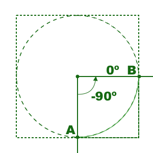
That creates the arc that we need, which produces this:
So that’s our custom CornerTreatment created. It is not possible to apply a custom CornerTreatment through XML – it needs to be done using ShapeAppearanceModel.Builder:
class MainActivity : AppCompatActivity() {

    private lateinit var binding: ActivityMainBinding

    override fun onCreate(savedInstanceState: Bundle?) {
        super.onCreate(savedInstanceState)

        binding = ActivityMainBinding.inflate(layoutInflater)
        setContentView(binding.root)

        binding.custom.setShapeBackground()
    }

    private fun View.setShapeBackground() {
        val cornerSize = resources.getDimension(R.dimen.corner_size)
        background = MaterialShapeDrawable(
            ShapeAppearanceModel.builder()
                .setAllCornerSizes(cornerSize)
                .setTopLeftCorner(CutCornerTreatment())
                .setBottomRightCorner(ConcaveRoundedCornerTreatment())
                .setTopEdge(TriangleEdgeTreatment(cornerSize, true))
                .setBottomEdge(TriangleEdgeTreatment(cornerSize, true))
                .setLeftEdge(TriangleEdgeTreatment(cornerSize, false))
                .setRightEdge(TriangleEdgeTreatment(cornerSize, false))
                .build()
        ).apply {
            fillColor = ColorStateList.valueOf(getThemeColor(R.attr.colorPrimary))
        }
    }

    private fun getThemeColor(@AttrRes attrId: Int) =
        TypedValue().let { typedValue ->
            theme.resolveAttribute(attrId, typedValue, true)
            typedValue.data
        }
}
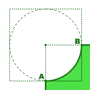
Here I have only applied it to a single corner, but we can apply it to all by calling the setAllCorners() method instead.
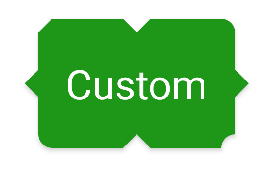
Although it is slightly tricky to see, the shadow does follow the contours of the concave corner in the bottom right.
I should point out that this button is hideous. It’s an example of how we can customise the outlines of our controls in various different ways but there is simply far too much going on here – don’t do this!
While it would require a bit of work to use a custom CornerTreatment across our entire app, it is certainly something that can enable some interesting shape alternatives. For those interested in custom EdgeTreatement I would suggest taking a look at the source code of TriangleEdgeTreatment to understand how that works, and then you can create your own based upon that knowledge
That concludes our exploration of Material Shapes. The source code for this article can be found here.
© 2020, Mark Allison. All rights reserved.
Copyright © 2020 Styling Android. All Rights Reserved.
Information about how to reuse or republish this work may be available at http://blog.stylingandroid.com/license-information.
