In the previous article in this series we applied a style to the navigation Spinner and its associated drop down ListView, but found that this style did not get applied to the Spinner that we added manually using the actionViewClass attribute of the MenuItem definition in our menu XML. In this article we’ll find out why.
SO far in this series, the examples have followed quite a similar formula: Define a style, then apply it to an item via the theme. In this case we appear to have applied the style correctly to one Spinner control, but not the other. This is where applying styles to the ActionBar can begin to get a little confusing: When we get something working, we can look at our styles and theme and it makes perfect sense; but when things aren’t working, we can still look at our styles and theme and it makes perfect sense – but it just doesn’t work!
If you are in this situation, the best advice is to find working code which does what you’re trying to do. Once of the best sources of this is the Android source and you can look at the styles and themes baked in to the core OS itself here.
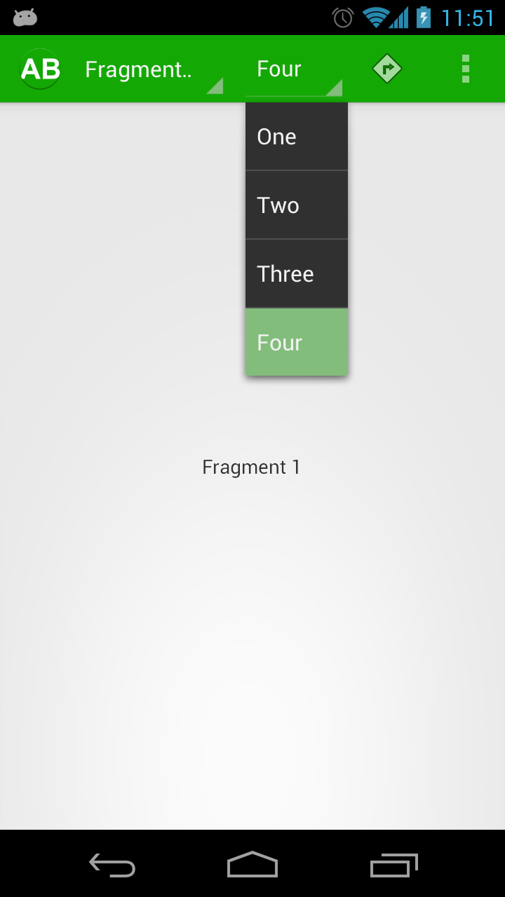
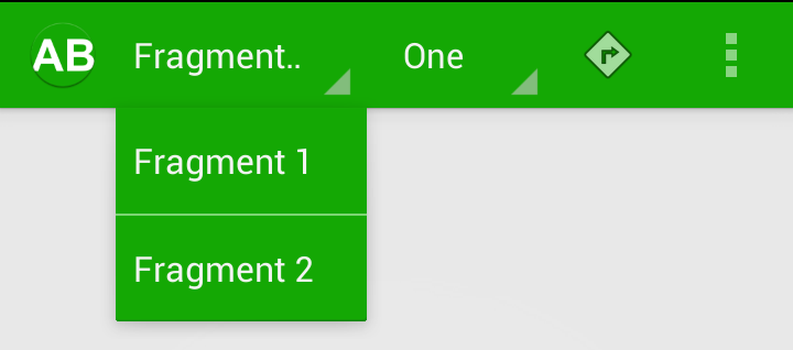
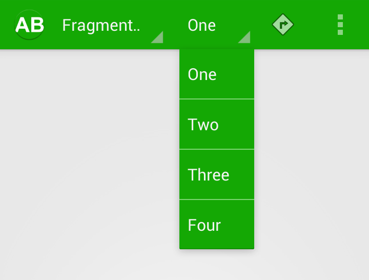
So, back to our problem. If we check out the behaviour of the second drop down, it’s actually pretty close to what we want:
The Spinner itself looks OK, and the selector is correct, it is just the background of the drop down that is wrong. Let’s have a look at out theme:
[xml] [/xml]We are applying some specific styles to Spinners in general which explains why the style gets correctly applied to some aspects of both Spinners; we can also see the dropDownListViewStyle which is applying the selector. The key thing appears to be actionDropDownStyle which applies a style with a setting for popupBackground which applies a green panel that was generated by ActionBar Style Generator:
[xml] [/xml]So, it would appear that this popupBackground is not getting set on the drop down of our second Spinner.
The simplest way to resolve this, is to actually apply a background specifically to both drop downs, and we can do this through the common style which sets the selector correctly. So let’s modify dropDownListViewStyle and explicitly set a background colour on our drop down ListViews:
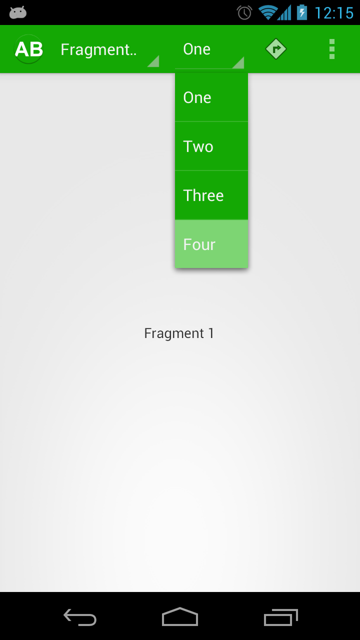
[xml] [/xml]If we run this, we can see that the background is now correct:
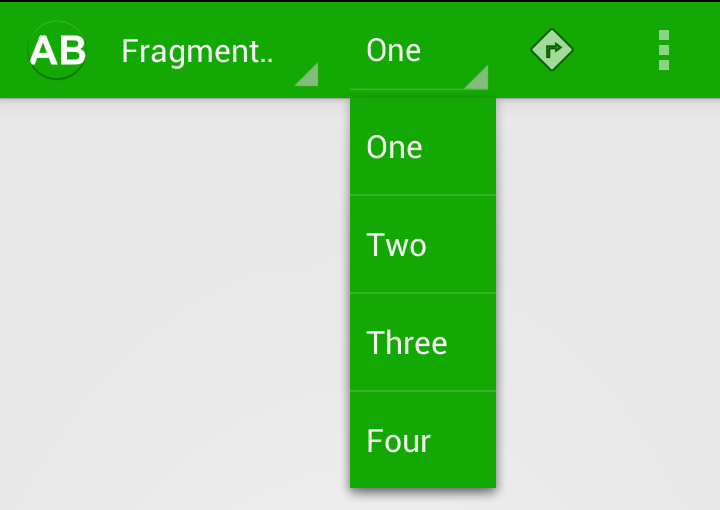
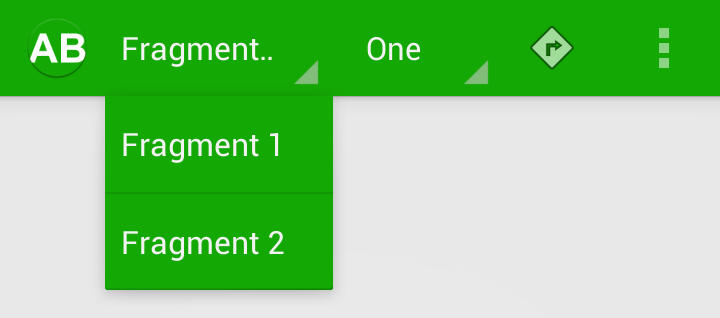
So we’ve done it, haven’t we. Actually we haven’t. We’ve got a very close approximation, but if we look carefully we can see small discrepancies.
The navigate Spinner doesn’t have a line below it, whereas the second one does:
When we click on the navigation Spinner, it has a green highlight, but the second Spinner has the default blue highlight:
Finally, the drop down of the navigation Spinner has quite a soft drop shadow, but the second Spinner has a much stringer one:
This is another way that styling the ActionBar can become frustrating, you feel that you’re almost there, but then start spotting these minor discrepancies. What this is actually telling us is that we are not applying the same style to both Spinners. There are certain defaults which are getting applied to the second Spinner, but we are not actually applying the same style as is being applied to the navigation Spinner. Think back to when we looked at our theme. The key line is:
[xml][/xml]
This applies the correct style to the navigation
We use the same style as we have used for the navigation Spinner. We can also remove the background that we added to DropDownListView as this is no linger needed if we apply a consistent style. Now everything works, and we have a uniform look across the Spinners:
We’re almost there, but the eagle eyed will have spotted that there is still a small discrepancy: The dividers of the ListViews do not match. This is because of the light theme with a dark action bar that we’re using. The easy fix for this is to define an explicit divider in our common style:
[xml] [/xml]This gives us a consistent divider:
Finally we have both of our Spinners correctly styled.
If we compare the project code to how it was at the beginning of this article, we’ve actually added 3 lines of XML to our style, that’s all. We did go down a blind alley in the process, but this really sums up how getting ActionBar styling working correctly can be in reality: Lots of effort to find the correct, rather simple solution.
In the next part of this series we’ll look at applying a style to the search EditText widget in our ActionBar.
The source code for this article can be found here.
© 2012 – 2015, Mark Allison. All rights reserved.
Copyright © 2012 Styling Android. All Rights Reserved.
Information about how to reuse or republish this work may be available at http://blog.stylingandroid.com/license-information.





How to set different color for text items in actionbar Spinner and content?
The source code for this article can be found … 404 … Thank you very much!
So GitHub change their API and it’s my fault?
The link has been updated, but less sarcasm over a problem that isn’t of my making would be nice. Comments like this make writing and providing a completely free blog all the more worthwhile.