I often see questions asking how to create Android layouts which will work across a wide range of devices with different screen sizes and densities. There is no one single answer to this, there are a number of techniques that you can use. In this article we’ll look at some of these techniques. We have covered some general layout techniques in the article on Intelligent Layouts, but in this article we’ll expand on these concepts further.
We’re going to break with Styling Android tradition in this article because, rather than iteratively building to the desired appearance / behaviour, we’re going to start with a finished example, and examine how it achieves the desired result. A really good example of an app which scales well on many devices is Launcher, the default home screen for an Android device.
Let’s start by downloading the code for this article. For this code I have lifted many of the required graphical assets directly from the Laucher2 source in AOSP. As per the AOSP licensing terms, this code is released under Apache License 2.0.
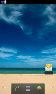
If we run this (on a Nexus S, in this case) we see the following:
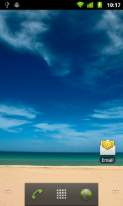
This is a pretty good simulation of how the standard launcher looks if we compare it to Launcher2 running in a 480×800 emulator:
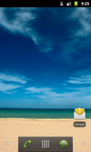
The Email icon positioning is very slightly different, as is the positioning of the text relative to the icon, but it’s pretty close, and works as an example of a dynamic layout which works across a variety of screen sizes, aspect ratios, and densities.
So, how does this look on a range of other screen sizes? Here are a selection of captures taken from the Graphical Layout tool which is available as part of ADT 11 (Please note that the text colour is not properly rendered here, but it will render correctly on a device:
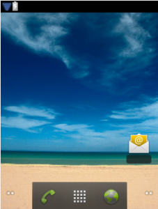
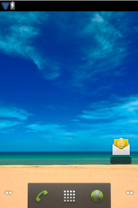
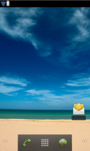
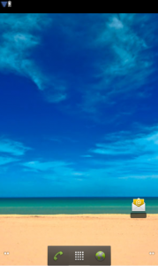
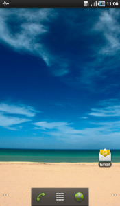
The final example is from an actual Galaxy Tab which shows that this works on real devices and not just the development tools (and that the text does indeed render properly on a real device!). We can see on the two largest displays, the icon is beginning to look a little lost, but we are getting in to a “large” generalised size, so we could actually increase our icon grid size to 5 x 5, by putting an alternate layout in res/layout-large, and this is precisely what is done on the Galaxy Tab.
Android contains a powerful layout engine, which is specifically designed to work across a wide variety of screen sizes and densities. The key to making our layouts flexible is to give Android as much freedom to do its thing as possible. There is something of a trade-off: By allowing Android to manage the layouts, we lose the ability to precisely position controls to the pixel precision.
Some general rules are:
- Never use AbsoluteLayout. Not only is it deprecated, it is precisely the kind of pixel-perfect layout that blocks Android from doing what it does best.
- Weights are an extremely powerful method of telling Android how we want to size and position controls in relation to each other.
- Never use pixel (px) values for anything. Avoid using points (pt), millimeter (mm), and inch (in) values. If you must specify a pixel value, then use density-independent pixels (dp/dip) or scale-independent pixels (sp). Wherever possible, use combinations of fill_parent, wrap_content, and weights in place of any pixel values.
- Always try to use shape drawables. They will always scale better than their bitmap counterparts.
- Where shape drawables will not meet your requirements and you need to use bitmap drawables, provide 9-patch graphics wherever possible, and also provide graphical assets optimised for different screen densities (i.e. ldpi, mdpi, hdpi).
In the second and concluding part of this article, we’ll look at the XML layout, and break it down to show how it works.
© 2011 – 2014, Mark Allison. All rights reserved.
Copyright © 2011 Styling Android. All Rights Reserved.
Information about how to reuse or republish this work may be available at http://blog.stylingandroid.com/license-information.


Every Android designer must want to read this article Thanks buddy
While the described approach handles different screen sizes and densities, it hardly addresses different aspect ratios, wich can vary from 1.3 up to 1.7. It may turn out, that 4×4 design fits some devices, while the others look better with 5×4 or 4×3, which brings in some extra complexity.
Yes, but hopefully it covers the necessary techniques that you need use.