In the previous article we got our Text Clock widget telling the correct time, and it was published to Google Play. While the widget functions correctly, there are a couple of things that can be improved. In this article we’ll look at those and address them.
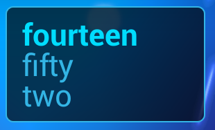
The first thing that to address is the font used for the display. The current version of the widget looks like this:
A bold font is used for the hours and a normal font for the minutes. It would give more contrast t use a thinner font for the minutes and fortunately Roboto (the default typeface introduced in Ice Cream Sandwich) has a “light” variant that would suit our needs perfectly. However this is where the problems arise. The “light” variant was only introduced in Jelly Bean and is only available on those devices. Moreover Roboto was only introduced in ICS, so what about older devices (and the app is backwardly compatible to Android 1.5)?
It is possible to include custom typefaces within the APK and load them dynamically at runtime. There is an excellent article by Andreas Nilsson which offers details of how to do this and some great tips for optimising things. On the face of it, that would be a great solution: Include the correct typefaces, and load them dynamically. There is a problem, though.
The current (at the time of writing) version of Android (Jelly Bean) has no means to address custom typefaces from XML layouts or styles.xml – because we have to manually load things, and there’s currently no mechanism to map these so they’re visible to our XML layouts and themes. We can easily apply things programatially using the setTypeface() method of TextView, but we do not have direct access to our TextView objects. For an app widget we get access to the Views in the widget layout using RemoteViews and this class does not provide us with a mechanism for programatically changing the typeface of our TextViews.
Rather than try and build backward compatibility of the look of the font in to our app, let’s instead modify it to take advantage of the typefaces where they are available on the device. So pre-ICS devices will use their default font of Droid Sans, ICS devices will use Roboto, and Jelly Bean devices will take advantage of the “light” variant of Roboto being available. This approach is actually quite sensible because it actually keeps things consistent on the user’s device. If the user consistently sees Droid Sans across all apps on his device, then using Droid Sans in our widget makes perfect sense.
So how do we achieve this? Actually it’s really simple because we don’t actually refer to Roboto by name anywhere. Our existing styles.xml looks like this:
On an ICS or later device this will use Roboto, and on an earlier device this will use Droid Sans. But what about using the “light” variant on Jelly Bean? To do that, we need to add a new version of styles.xml in res/values-v16/styles.xml:
This will only override the minutesTextWidget style on JB devices, and add the fontFamily of sans-serif-light. So when we run this on a Jelly Bean device we now see thinner text for the minutes:
It’s quite a subtle change, but often it’s the subtly differences that make the difference.
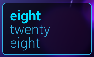
The other thing worth addressing is that the widget doesn’t look quite so good on a Nexus 10. The previous screen shot was taken from a Galaxy Nexus, and here’s exactly the same widget running on a Nexus 10:
The ‘g’ in the bottom line of the time on the Nexus 10 is hitting the border of the widget, but it’s fine on the Galaxy Nexus. Why?
The reason is that the two devices have different pixel densities (316ppi on the Galaxy Nexus and 300ppi on the Nexus 10) which is causing a difference in rendering. One solution would be just to make the text a little smaller, but that would also make it smaller on the Galaxy Nexus, which currently renders perfectly. So what we can do is use the resource management to make the text slightly smaller on a Nexus 10 by creating res/values-xlarge-xhdpi/dimens.xml:
20dp
If we run that, things look a lot better:
We’ve resolved a couple of minor issues that weren’t causing major problems, but just improve the look and feel of our app. This will now be published as version 1.0.1 to Google Play.
In the next article we’ll look at adding some additional functionality to our widget.
The source code for this article can be found here, and TextClock is available from Google Play.
© 2013 – 2014, Mark Allison. All rights reserved.
Copyright © 2013 Styling Android. All Rights Reserved.
Information about how to reuse or republish this work may be available at http://blog.stylingandroid.com/license-information.


Hi Mark,
Do you have any idea why sans-serif-light
needs to be specified in styles.xml under values-v16 folder, instead of just inside the default values folder, although setting android:fontFamily attribute directly on a element inside a layout file will work even when that layout file is not -v16?
As always, thanks for your valuable tutorials!
I personally think that it makes the code much easier to understand if it is clear that certain resources are only available in certain API levels.