In the previous article in this series we have looked at some techniques for using transparency as a means to keep our text clearly visible. In this article we’re going to move away from text and look at some other neat things that we can do with transparency.
In earlier iterations of Android, there was an effect applied to ListViews which gave the effect that the top edge of the ListView content was rolling over as it went out of view. Here is an example from this from the Settings app in Cupcake (1.5):
Notice how the top edge of the list content appears to slide under the title bar? It should not be too much of a surprise that, because I am showing this in an article about transparency, that this effect can be achieved using transparency.
Let’s start by creating a new drawable in res/drawable/fadetop.xml:
[xml]
[/xml]
This is going to create a vertical gradient which starts at fully opaque 50% grey to fully transparent 50% grey. This is the basic drawable which creates the effect that we require. All that we need to do is use this in the correct way to get the effect that we require:
[xml]
[/xml]
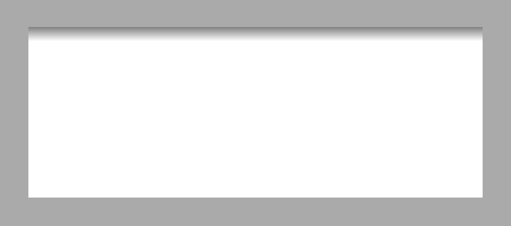
What we have here is a RelativeLayout with a white background. it is the ImageView inside it which creates the desired effect by using the fade drawable. We set the width of the ImageView to match the parent, the height to 10dp, and set android:layout_alignParentTop="true" to align it to the top of its parent, the RelativeLayout. This gives us the following:
If we wanted to apply the same effect to the bottom edge of the RelativeLayout, we would need to create another drawable in res/drawable/fadebottom.xml:
[xml]
[/xml]
This is identical to fadetop.xml except that the gradient is inverted by using android:angle="90" instead of android:angle="270".
We then align it to the parent using android:layout_alignParentBottom="true" instead of android:layout_alignParentTop="true":
[/xml]
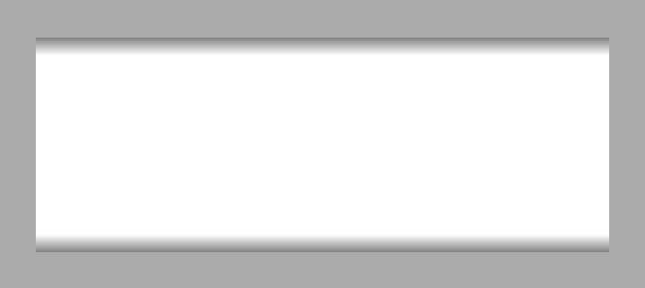
Running this gives us the desired effect at the bottom as well:
This is a somewhat simplified version of the actual ListView implementation of this effect. ListView allows the colour of the fade to be controlled using the android:cacheColorHint attribute. This would be fairly easy to replicate, however. Rather than using a shape drawable defined within XML, we simply create a GradientDrawable programatically and we can dynamically set the colour.
In this series I have only really scratched the surface of some of the cool things that we can achieve using transparency. You can stumble across some really neat effects just by playing around with transparency settings. Often it is necessary to tinker with the hue (the RGB component of the colour definition) and the transparency (the Alpha component of the colour definition). For example #F777 and #7000 will look almost identical against a white background, yet completely different against a black background, and some experimentation is usually required to work out which (or often a value somewhere between the two) should be used to get the desired effect.
The source code for this article can be found here.
© 2012 – 2014, Mark Allison. All rights reserved.
Copyright © 2012 Styling Android. All Rights Reserved.
Information about how to reuse or republish this work may be available at http://blog.stylingandroid.com/license-information.


1 Comment