One of the new features in the Android O developer preview is Adaptive Icons. While it will be a long time before may of us will be in a position to specify minSdkVersion 26, this is actually one of those feature that we can implement now and it will benefit users as and when they get Android O on their device, whilst having no impact on legacy users. Moreover there are some new icon creation tools in Android Studio 3.0 which actually make developers’ lives a lot easier not only for creating Adaptive Icons, but also for creating legacy versions of those icons as well. In this article we’ll take a look at these new tools.
 There is already a good explanation of Adaptive Icons in the official documentation which give some explanations of why Adaptive Icons have been introduced, and hint at some of the ways that they will be used going forward. While the documentation already provides an explanation of the icon tools within Android Studio, it is these that we’ll focus on to see how they can provide assistance even for legacy icons.
Before we continue it is worth pointing out that there a currently really big pain point with backwards compatibility which we’ll get to at the end. I would therefore suggest a quick read through of this article to decide whether it is worth your while implementing these just yet.
As regular readers will be aware, the vast majority of articles on Styling Android are accompanied by a sample app which demonstrates the concepts being discussed. For these sample apps, I like to use an appropriate Styling Android launcher icon. We’ll look at how I went about creating the new adaptive form of this icon.
The main concept of adaptive icons is that the foreground and background layers are separate. This enables the launcher to do some funky effects. While the launcher doesn’t do anything yet, there may be some interesting stuff coming soon…
For the foreground of the adaptive icon I’m using a version of the Styling Android logo with a long shadow effect:
The bottom right edge looks weird but, don’t worry, this won’t be visible in the final icon.
Next we have the background. I found a royalty-free background image in a complementary colour to the predominant green of the foreground component:
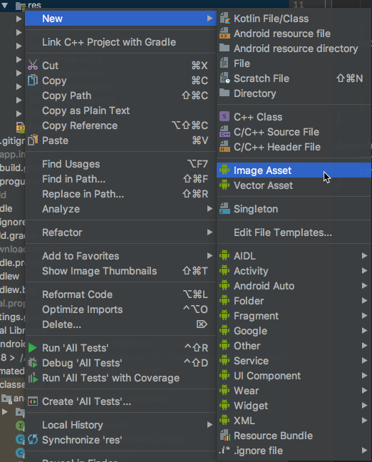
To create the adaptive icon we right click on the res folder in the project view in Android Studio, and select New | Image Asset:
This brings up the all new image creation tools:
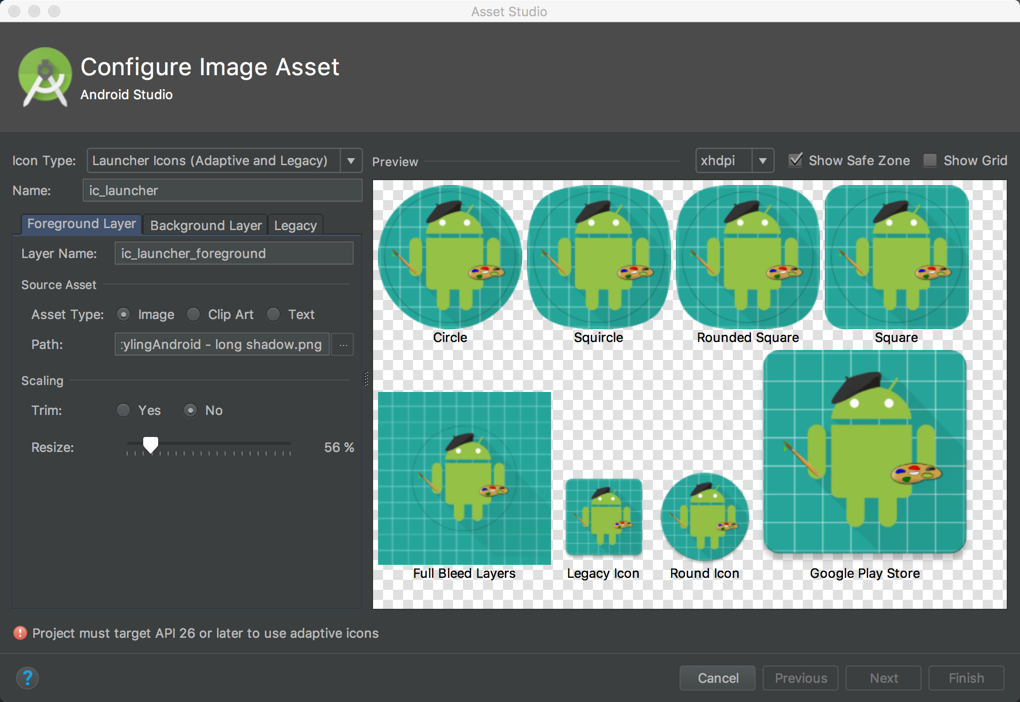
The icon type dropdown enables us to specify different types of icon that we may want to create, including ActionBar and notification icons. We’re interested in launcher icons so we’ll stick with the default selection of “Launcher Icons (Adaptive and Legacy)”. Next we’ll change the asset type to “Image” and select our foreground layer in the “Foreground Layer” tab:
We can see already that the odd ‘tail’ on the long shadow is now outside the bounds of all of the icons which will be generated.
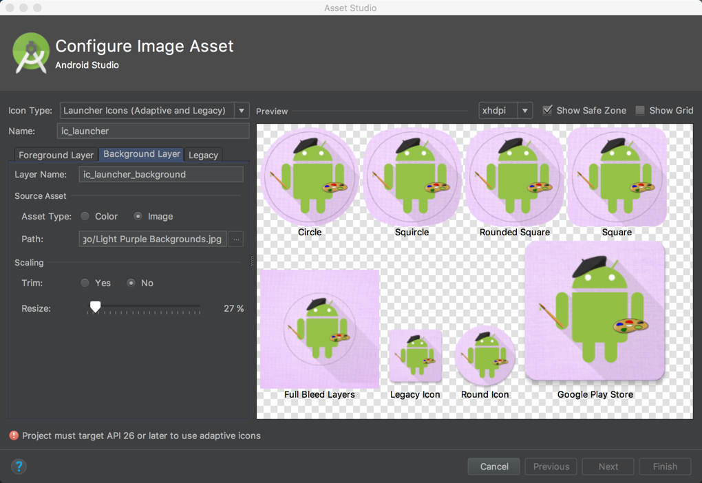
Next we need to switch to the “Background Layer” tab and add our background image:
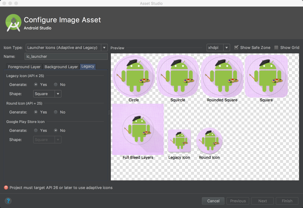
Next we switch to the “Legacy” tab which allows us to control the legacy icon types which will be generated:
This is quite interesting because we can actually generate static legacy icons from our adaptive assets. That really simplifies the task of generating both square and round icons after round icons were introduced in Nougat 7.1. In this case I have no need for a Play Store icon (as I won’t be publishing this app to the play store) so I have disabled it.
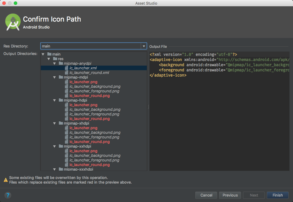
The final stage is a check of which output files will be generated. The files shown in red are those that already exist and will be overwritten:
The default ic_launcher.png and ic_launcher_round.png icons which were the default from the project creation are those that will be overwritten.
That’s it. All of our assets have been generated. If we run this on a device running KitKat or earlier, or Android O preview, then everything is fine. Here is the icon on a KitKat device:
However, if we run it on a device running anything between Lollipop (API 21) and Nougat (API 25) the default system icon will be used. This is on a Nexus 9 running Nougat 7.1.1:
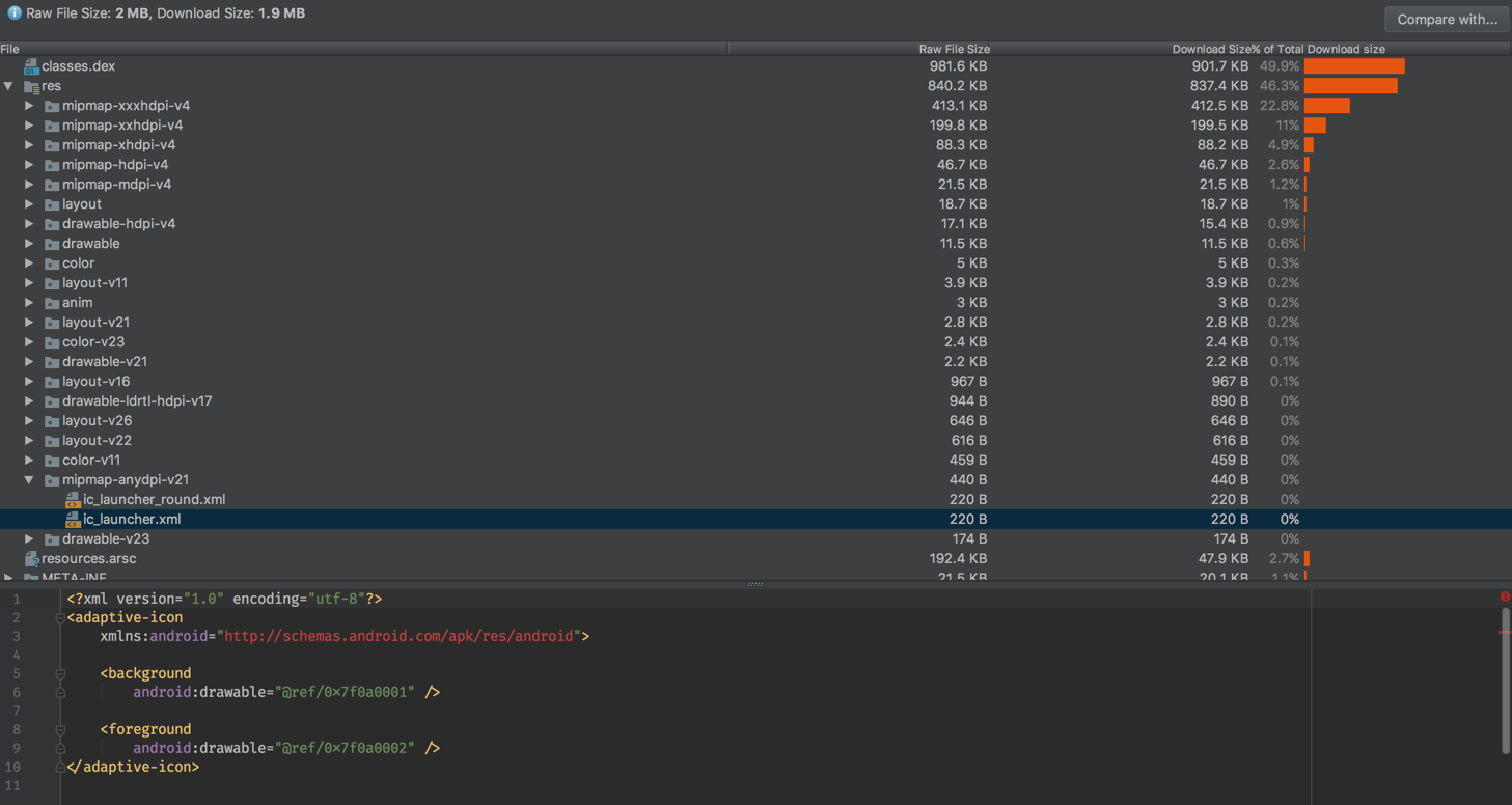
It’s easy to see what the problem is using the APK analyser built in to Android Studio:
The contents of mipmap-anydpi-v21 are the cause. It is the <adaptive-icon>: assets which are being placed in this folder, yet only devices running Android O will actually recognise this format hence the failure on Lollipop to Nougat. This fix will be to change this folder to mipmap-anydpi-v26.
I have raised an issue, so hopefully this will be fixed soon.
So, aside from this one bug in the build tools, the new icon tools are really useful and should make life much easier.
The source code for this article is available here.
© 2017, Mark Allison. All rights reserved.
Copyright © 2017 Styling Android. All Rights Reserved.
Information about how to reuse or republish this work may be available at http://blog.stylingandroid.com/license-information.



For the foreground layer you chose “a version of the Styling Android logo with a long shadow effect”, but according to the official adaptive icon docs, “you must provide icon layers as drawables without masks or background shadows around the outline of the icon”. Do you think the goal is that eventually the system will automatically create shadows dynamically – based on elevation and/or user preference? If it is, it’s not there yet, because I tried removing the long shadow from the icons in your sample project, but the resulting adaptive icon doesn’t appear to have any kind of shadow.
There is no shadow around the outline of the icon. The long shadow is part of the icon itself.
which version of the Android studio it was?
If you read the first paragraph of the post you will see that it is Android Studio 3.0.
Thank you very muchhhhhh!!!!!
I was going crazy for fix the icon error. Anyone explains it anywhere. You are a crack!!!
Thank you 🙂
Once again, a lifesaving resource. Mark, I owe you more beer and whiskey (at this rate, when I do eventually pay up, you are going to have enough to open your own liquor store).
Thanks for your kind words, Mike. Just hearing that people find this stuff useful is thanks enough. That said, I certainly look forward to the next time we get to catch up over a beer (whisky) or two.
nice website for android developer
Hay Mark,
Nice article. But my icon background color is always white.
I am testing in Android P (Pixel 2 emulator).
I can’t really offer any advice without seeing your implementation. Perhaps you would be better off trying the good folks at https://stackoverflow.com as I really don’t have any available bandwidth to provide free developer support.