At Google IO 2016 Google announced a new Android layout named ConstraintLayout. Despite the initial release being labelled as an Alpha release, it is actually pretty stable (with a few caveats). In this series of articles we’ll take a look at this new layout-kid on the block and try and get some insights in how best to use it.
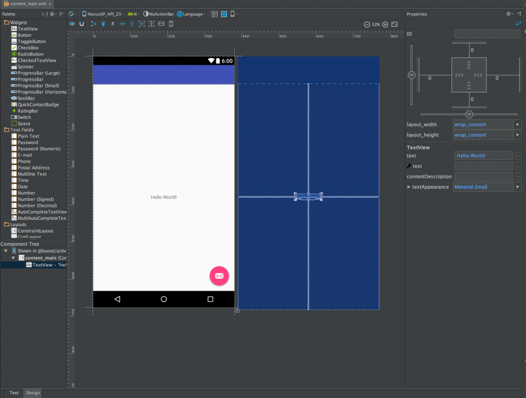
Now that we’ve learned the basic concepts of ConstraintLayout let’s turn our attention to the visual editor to see how we can create constraints. If we start by creating a new project with a Basic Activity in Android Studio 2.2 Preview 1 or later it will create us two layouts activity_main and content_main. This is the standard pattern for the Basic Activity template. We also get a menu generated automatically and this can be used to check out the visual menu editor. We’re focusing on ConstraintLayout so we’re interested in content_main, so if we open that and switch to Design view (using the tabs at the bottom):
On the left hand side we have the palette, which contains the available widgets which can be dragged in to our layout, and below that is the Component Tree which shows the hierarchy of our layout and all of the component widgets. In the middle we have the main editor panel which includes both the WYSISYG preview of our layout, and the new blueprint view. On the right is the Properties panel which shows the properties of the currently selected widget.
As we’re focusing on ConstraintLayout, I’m not going to go in to all of the details of the new visual editor, and our main areas of focus are going to be the main editor and Properties panels. However the Component Tree can be really useful in a couple of cases. Firstly if you are struggling to select a specific widget in the main editor panel because it has other widgets in front of it, you can select it on the Component Tree. The second really useful thing is that you can drag widgets to alter their order within the layout, and therefore the order that they’re drawn in.
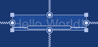
As I’ve already mentioned, the vast majority of our focus when creating layouts with a ConstraintLayout root is going to be the main editor panel and the Properties panel. The blueprint view shows all of the currently defined constraints within the layout whereas the WYSIWYG view only shows them when it has focus (with the mouse inside its bounds). When you select a widget in either view it a number of handles will appear around it:
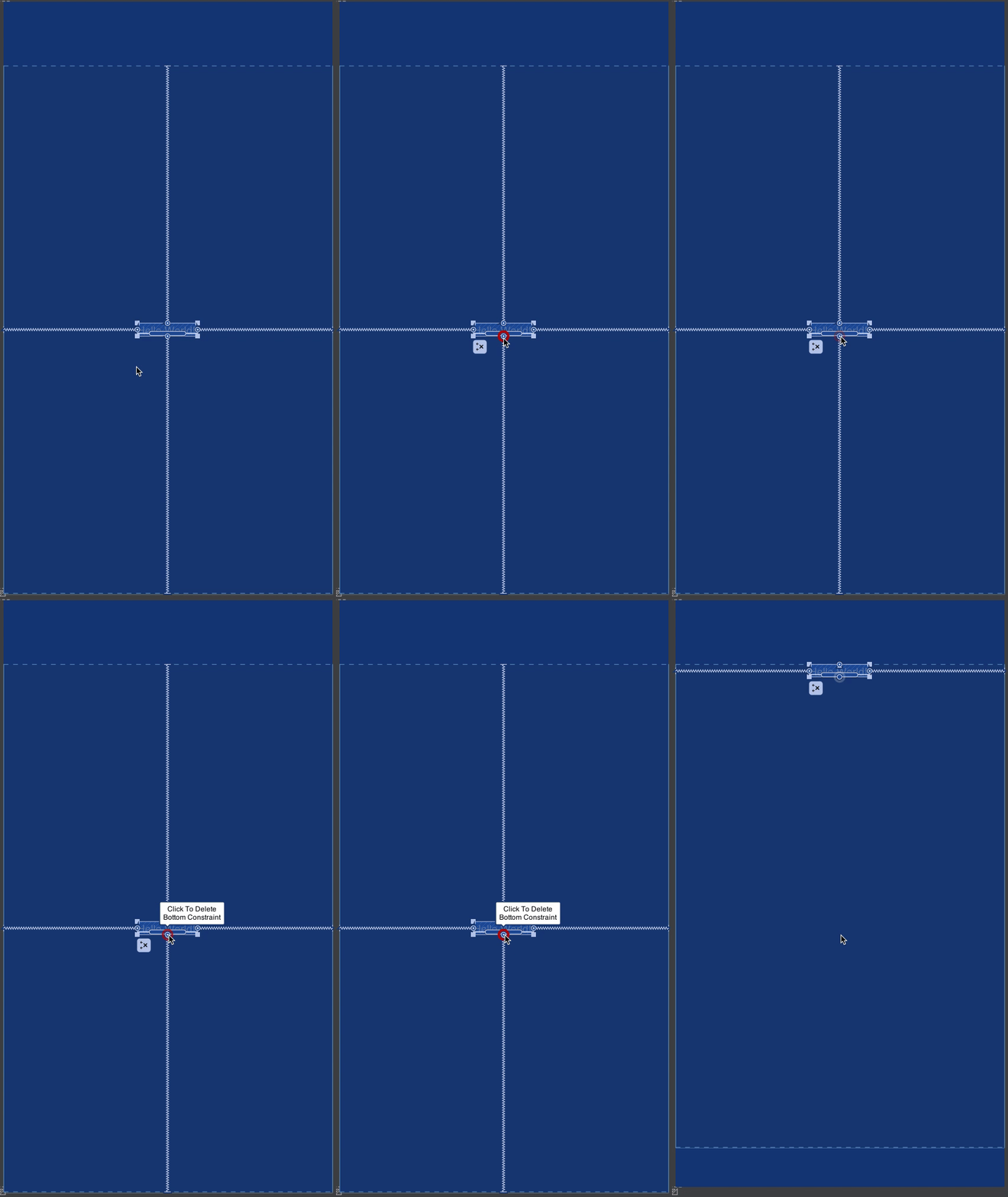
The square handles on the corners can be used to resize the widget; the circular ones at each edge are the constraint anchor points; and the elongated rounded-rectangle in the centre is the text baseline anchor point. In the image we can see that we have constraints attached to each of the edge anchors (the zigzag lines represent a specific type of constraint – more on this later). If you hover over one of these anchors which has a constraint attached then clicking on it will remove the constraint – note how the TextView jumps to the top of the screen if how remove the bottom constraint because all that remains is the top constraint:
We can create a new constraint by clicking on the anchor point and then dragging to an anchor point on a sibling, or in this case the ConstraintLayout itself – note how before we actually release the mouse button the TextView jumps to the position it would occupy one the constraint has been created giving a preview of how it will look:
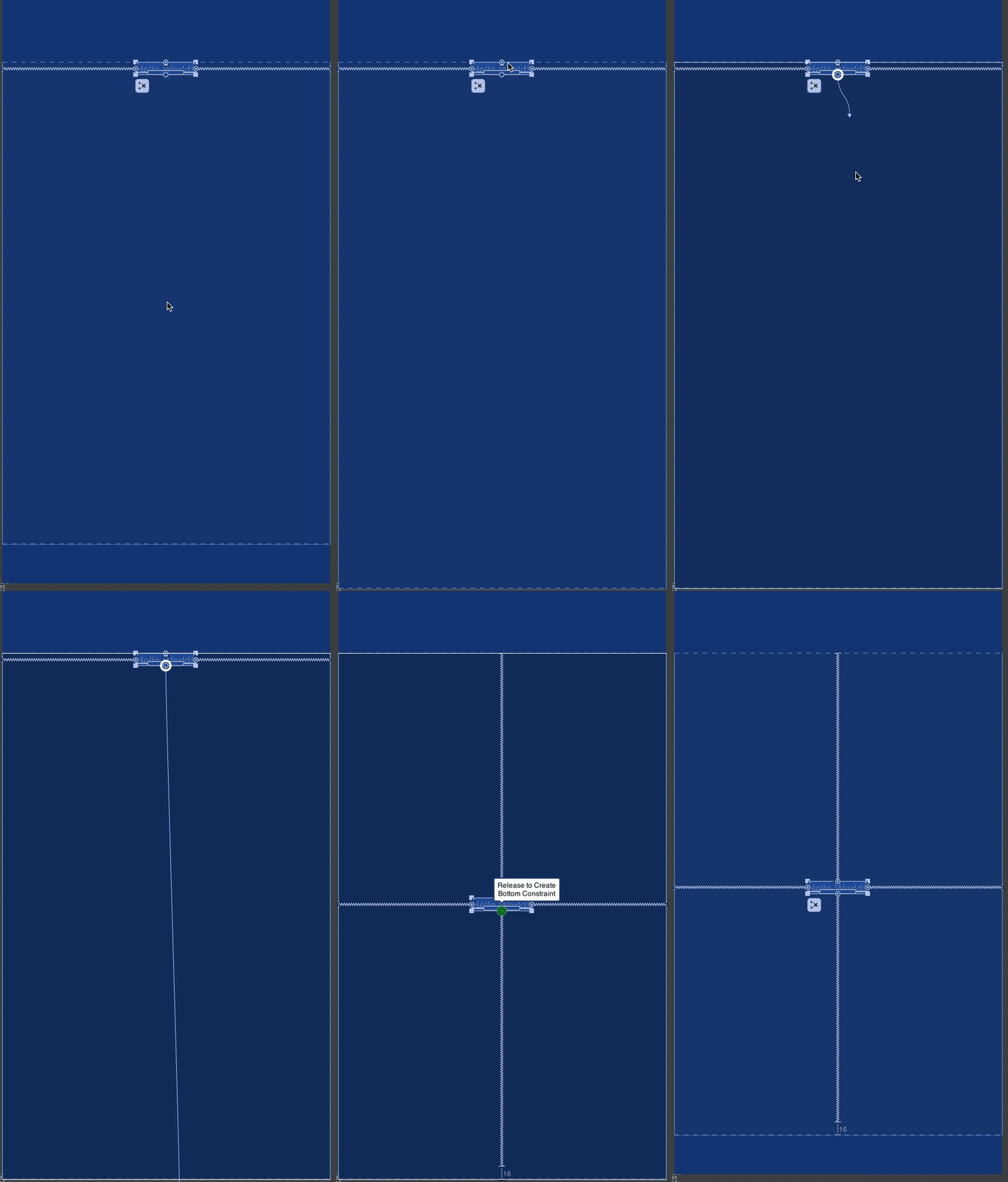
The rules for creating constraints are actually pretty simple: You can only create a constraint from a horizontal anchor point (left or right; or the baseline anchor point) to a horizontal anchor point on another widget or the parent ConstraintLayout; and you can only create a constraint from a vertical anchor point (top or bottom) to a vertical anchor point on another widget, or the parent ConstraintLayout.
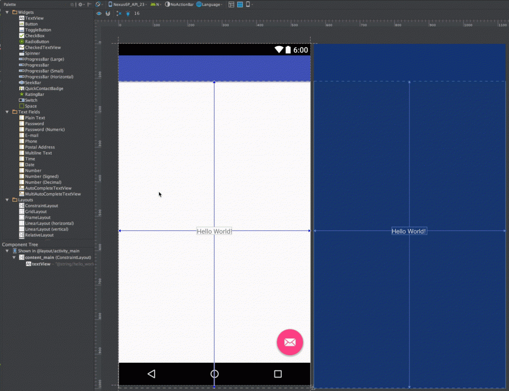
If we drag another TextView below the existing one, notice how it snaps to the margin which we have preset to 16dp using the toggle in the toolbar:
Once we drag it in to rough position we can then create constraints to position it relative to the existing TextView:
There is an alternative mechanism we can use, though. If we toggle the autoconnect toggle in the toolbar:
This time, if we drag it roughly in to position it automatically creates some default constraints based upon where wee dropped it:
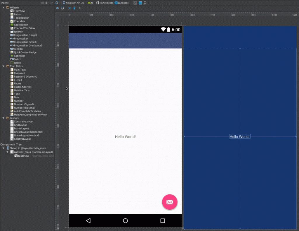 Initially the very slow animations appear a little jarring because they seem to take too long. However the reasoning behind this is that it gives you a couple of seconds to change your mind after you’ve dropped the new widget. You don’t have to wait for it to finish, if you’re happy you can just carry on working and just ignore it.
So let’s take a look at the XML that this actually produces:
<?xml version="1.0" encoding="utf-8"?>
<android.support.constraint.ConstraintLayout xmlns:android="http://schemas.android.com/apk/res/android"
  xmlns:app="http://schemas.android.com/apk/res-auto"
  xmlns:tools="http://schemas.android.com/tools"
  android:id="@+id/content_main"
  android:layout_width="match_parent"
  android:layout_height="match_parent"
  app:layout_behavior="@string/appbar_scrolling_view_behavior"
  tools:context="com.stylingandroid.constraintlayout.MainActivity"
  tools:showIn="@layout/activity_main">

  <TextView
    android:id="@+id/textView"
    android:layout_width="wrap_content"
    android:layout_height="wrap_content"
    android:layout_marginBottom="16dp"
    android:gravity="center"
    android:text="@string/hello_world"
    app:layout_constraintBottom_toBottomOf="@+id/content_main"
    app:layout_constraintLeft_toLeftOf="@+id/content_main"
    app:layout_constraintRight_toRightOf="@+id/content_main"
    app:layout_constraintTop_toTopOf="@+id/content_main" />

  <TextView
    android:id="@+id/textView1"
    android:layout_width="wrap_content"
    android:layout_height="wrap_content"
    android:layout_marginTop="16dp"
    android:text="@string/textview"
    app:layout_constraintLeft_toLeftOf="@+id/textView"
    app:layout_constraintRight_toRightOf="@+id/textView"
    app:layout_constraintTop_toBottomOf="@+id/textView" />

</android.support.constraint.ConstraintLayout>
So, we can see that the parent ConstraintLayout has layout_behaviour applied which controls behaviour within its parent CoordinatorLayout (further proof that they play nicely together). Looking at the first TextView we can see the constraints that correspond to the constraints we can see in the visual editor which centre it within the parent. Looking at the second TextView we can see similar constraints which correspond to those in the visual editor which position it relative to the first TextView.
So creating constraints is simple enough, and the XML that they produce is actually fairly straightforward and understandable.
In the next article we’ll look at how changing some of the standard layout attributes which we’re already familiar with can alter how these constraints are applied to a widget.
© 2016, Mark Allison. All rights reserved.
Copyright © 2016 Styling Android. All Rights Reserved.
Information about how to reuse or republish this work may be available at http://blog.stylingandroid.com/license-information.


Another excellent post on ConstraintLayout thanks!
I really hope this layout will became the standard to be used from now on …
I will keep experimenting with it!