
One of the foundations of Material Design 2.0 is the ability to define shapes to reinforce the branding being applied to our apps. At first glance what we are able to control appears to be somewhat limited, but in this short series we’ll go deeper down the rabbit hole to explore some of the more subtle things that we can do with material shape.
Let’s start by looking at the holistic approach to applying shapes to our app: via the theme. This is the way that may apps will apply shape as it is the easiest and fastest way to consistently apply custom shapes across the entire app. The basic principles that shape themeing operates on is that all material components which support custom shapes will in to one of three size buckets: small, medium and large. Small components are generally discrete widgets such as buttons, text fields, tooltips and snackbars. Medium components are usually containers for these small items such as cards, dialogs, and menus. Large components are larger containers such as navigation drawers and bottom sheets. For the vast majority of cases, defining the shapes for these three size buckets will be all most apps need, so we’ll begin by looking at how we can do this.
To apply shapes to our theme we need to define styles for the three size bucket theme attributes:
. . .
We’ll look at the contents of the style definitions in a moment, but what we have here does an awful lot for us. Whenever one of the Material components that falls in to the ‘small’ size bucket is inflated, it will look up the value of shapeAppearanceSmallComponent from the theme and use that to define the shape of the view. That is unless the shapeAppearance is explicitly specified in the layout, or any of the shape attributes are overriden in the layout. This behaviour is nothing specific to material shapes (although it is the shape appearance that is being affected) but it is how styles and theme work in general. Any view will try and find a default style from the theme by looking up the value of a specific theme attribute, and that is precisely what is happening here.
Let’s now take a look at the style definitions:
. . .
Although this initially looks fairly simple, there is some clever stuff going on in these few lines. The first is hinted at by the base theme: ShapeAppearanceOverlay. This is working as a ThemeOverlay (which, once again, is not specific to Material shapes, but is a behaviour of the themeing framework). The overlay behaviour isn’t immediately obvious from this declaration because the overlay behaviour is actually implemented by the base ShapeAppearanceOverlay definition – that’s why it it is important that it contains the word Overlay in its name so that its name reflects its behaviour.
Although the concept of a ThemeOverlay is not specific to material shapes, it is worth a brief explanation of these because the behaviour that we’re looking at is dependent on the ThemeOverlay behaviour. Let’s dive in to ShapeAppearanceOverlay which is defined in the material components styles as:
On the face of it, that does not appear to do much, but looks are deceptive! The key to the overlay behaviour is the empty parent attribute - this is what causes the overlay behaviour.
Normally when we define a style, we would provide a parent style, and then we can override specific attributes to alter specific parts of that style. When we specify no parent, then the style will overlay whatever theme is being applied. In other words we might have two Activities and each has a different theme applied - perhaps one has a light theme and the other has a dark theme. If we apply a style with an explicit parent set, and colours defined within that parent will override the Activity theme. If we apply a theme overlay instead (i.e. a style with an empty parent) then it will use the colours defined in the current Activity theme, and it will fit in with the colour scheme of the current Activity. The ThemeOverlay mechanism is a key part of how things like defining colorPrimary in the theme ripple down to the child views - the Themes & Styles defined by Material Components use this technique quite heavily.
So if we define our own ThemeOverlay we can be sure that we're overriding only the specific attribute that we declare within our custom style, whilst allowing the active theme behaviour the apply.
So in ShapeAppearanceOverlay.Pill we override two attributes without affecting the active theme. The first is cornerSize which specifies the size of the corners. This can either be declared as a dimen as we have in ShapeAppearanceOverlay.Cut.Medium or as a percentage value as we have done in the other two shape appearances. The second is the cornerFamily which controls the type of corner effect used - in this case we specify a rounded corner. Alternatively we could use cut instead of rounded and we can see that used in the two Cut shapes.
We can now add a MaterialButton to a layout:
On one of the buttons we explicitly specify a shapeAppearanceOverlay which overrides the default set in the theme but the other button uses the shape appearance specified by shapeAppearanceSmallComponent in the theme, and the MaterialCardView uses the shape appearance specified by shapeAppearanceMediumComponent.
If we run that we get:
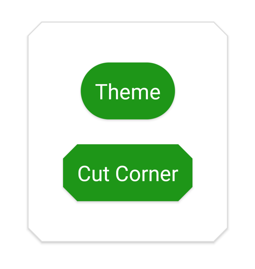
I really do not advise mixing up shapes like this - it is far better to have a coherent shape style within your app, but I have used very different shapes to make it obvious that different shapes are being applied.
One thing worth noting is that the shadows being generated closely match the shapes of the controls. This is easiest to see on the outer MaterialCardView but it applies to the buttons as well. This is the real advantage that correctly defining the Material shape has compared to simply using a custom background. The framework is able to extract the path data for the shape outline from the Material Shape definition and use this to calculate the shadows
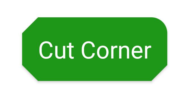
It is also possible to specify separate styles and sizes to each corner:
In this case we declare a separate cornerFamily which only affects the top right corner which results in this:
All in all this is pretty flexible, and correctly defining shapes at theme level is an easy win for consistently defining a shape identity across the entire app. That said there are some gotchas that can causing things to break, and there are also some further customisations that we can do. We'll explore these further in the next article.
The source code for this article is available here.
© 2020, Mark Allison. All rights reserved.
Copyright © 2020 Styling Android. All Rights Reserved.
Information about how to reuse or republish this work may be available at http://blog.stylingandroid.com/license-information.

Great article! I was especially glad to find out how to correctly generate shadows. Now I know you’ve got to change the Material shape, not just use a custom background.