
One of the foundations of Material Design 2.0 is the ability to define shapes to reinforce the branding being applied to our apps. At first glance what we are able to control appears to be somewhat limited, but in this short series we’ll go deeper down the rabbit hole to explore some of the more subtle things that we can do with material shape.

Previously we looked at how we can use the theming framework and, specifically, Theme Overlays to apply a consistent shape identity across our app. However there are some pitfalls that are easy to avoid once we are aware of them.
The first of these are actually functions of the way that Android styles and themes work which rely heavily upon inheritance of values. This inheritance model allows us to build complex styles and themes by combining attributes using this inheritance model. It is important to understand how this works because changes that we make may have knock on effects. An example will demonstrate this. Let’s alter our cut corner shape so that one of the corners is rounded:
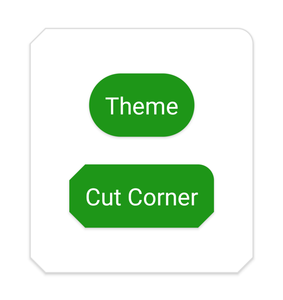
This seems innocent enough, but there is a small issue with the result:
The upper right corner of the Cut Corner button is now rounded, but the top right corner of the card background has also become rounded. This is because the style ShapeAppearanceOverlay.Cut.Medium – which is the shape appearance that is applied to the card – has an implicit parent style of ShapeAppearanceOverlay.Cut through the naming. Even though ShapeAppearanceOverlay.Cut.Medium declares <item name="cornerFamily">cut</item>, the finer grained <item name="cornerFamilyTopRight">rounded</item> is inherited from the parent style and so gets applied.
There are a couple of ways that we can fix it and the correct one will depend upon your requirements. Firstly, we can simply override this attribute in the child style:
Alternatively we could explicitly specify a different parent style:
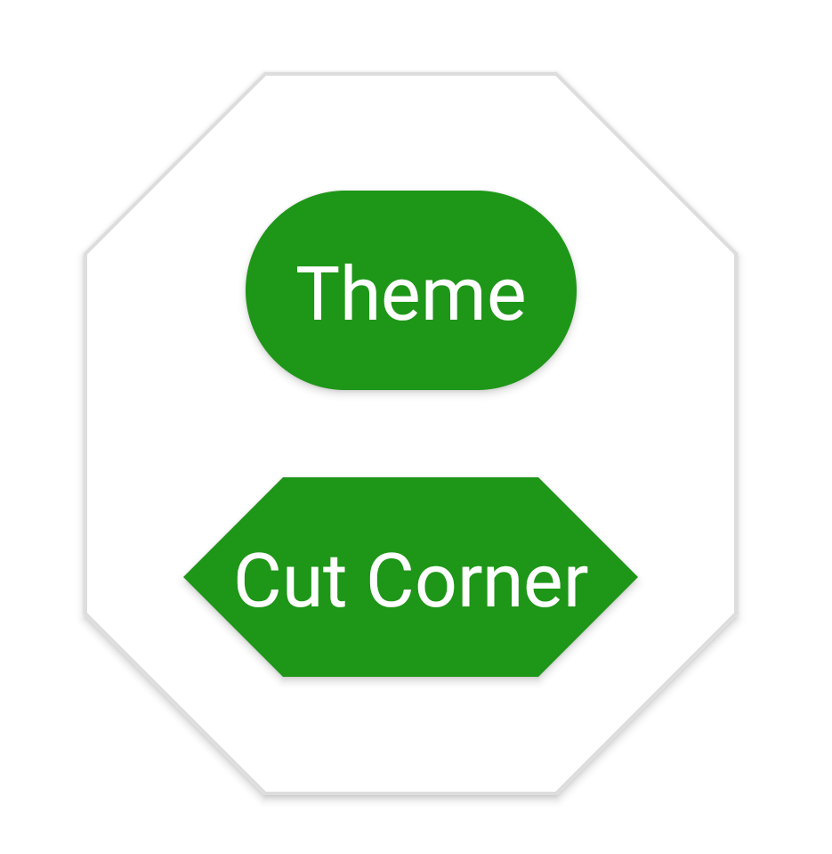
The next potential gotcha is somewhat related but actually a little more subtle. Suppose we were to change a corner size on ShapeOverlay.Pill:
Neither of the other styles have this as a parent so is seems a little strange that doing this also affects the “Cut Corner” button:
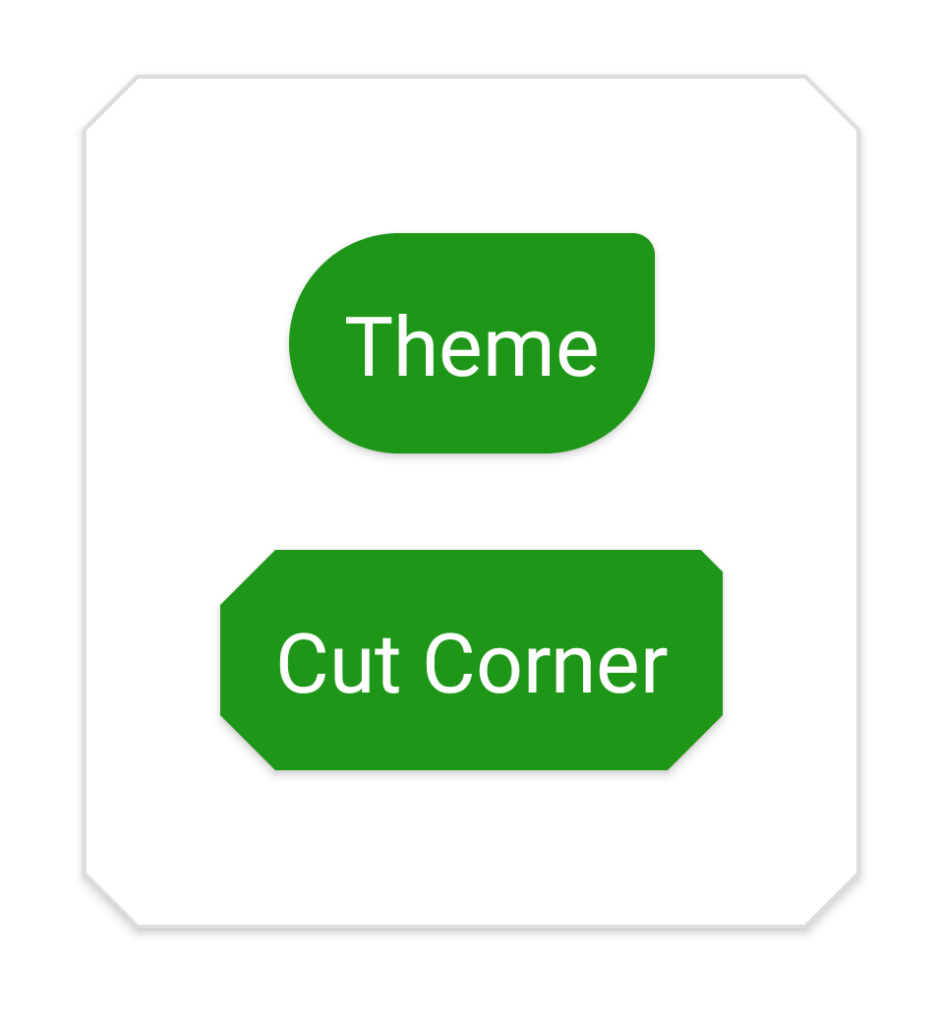
The card shape is not affected here, and that fact provides us with a clue as to what is happening. As before, the “Cut Corner” button is getting the <item name="cornerSizeTopRight">10%</item> that we applied to the ShapeAppearanceOverlay.Pill shape appearance, but it is not immediately obvious why.
The cause is actually because we declare shapeAppearanceSmallComponent to this style in the theme. When both buttons get inflated they read the default style attributes from the default theme, and so both get the <item name="cornerSizeTopRight">10%</item> attribute set. When the style that is explicitly set on the Cut Corner button is applied, this overlays the theme values, so the <item name="cornerSizeTopRight">10%</item> remains because that value is not specified in the ShapeAppearanceOverlay.Cut style, so the top right corner gets the inherited appearance from the default style.
Once again there are a couple of ways to work around this. Firstly, as before, we can override this attribute in the ShapeAppearanceOverlay.Cut style:
Alternatively, we could remove this customisation from the default style, and place it in it’s own overlay:
We then apply this overlay in the layout:
Next let’s turn our attention to some things to be careful of with our choice of shape. Let’s first change our cut shape to increase the corner size to 50%:
Note that ShapeAppearanceOverlay.Cut.Medium overrides cornerSize so won’t be affected by this change. This gives us:
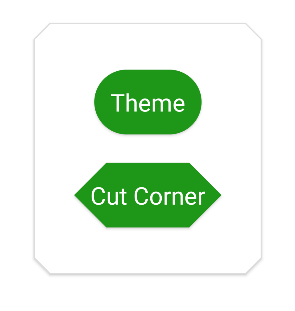
While there is noting wrong with this it is worth noting that the corners come much closer to the text now – even compared to the Theme button (which uses the theme default Pill shape) which also has a cornerSize of 50%. This is because the cut corner style removes more area from the shape than the rounded style (i.e. the area of the green filled area is larger with rounded corners than with cut corners). So it’s important to use plenty of padding with large cut corners (here we’re using 16dp padding on both buttons). I personally prefer the aesthetic of the 25% cut corners to the 50% ones, but that’s just a personal preference.
Another thing worth bearing in mind with using a percentage for the corner size is that this really does not scale well for use on medium and large size items. For example, if we use a corner size of 50% on ShapeAppearanceOverlay.Cut.Medium (the shape appearance that gets applied to our MaterialCardView) we get this monstrosity:
We can improve things a little by decreasing this to 25%:
However the corners are still encroaching on the child layout quite considerably and will require large amounts of padding to ensure that child views do not leak out of the card shape. So although this might be useful in some cases (such as if we wanted to create a stop sign), using a shape like this across an entire app would result in over padded layouts which are not easy on the eye. For this reason, the material design guidelines only suggest using percentage values for corners on small components. They also advise against using percentage corners on any component that may change size dynamically – as the control may change from a small size to a medium size, and the changing corner size may be too much going on with the view itself changing size.
Applying Material Shape is a very powerful tool when it comes to creating a strong visual identity within our apps, but we need to take care when using them to ensure that we structure our styles, themes, and overlays to avoid maintainability issues; and make careful shape choices.
In the next article we’ll look at how we can customise our shapes further.
I haven’t published the source code for this article as much of it is examples of problems, rather than solutions – and having that in a GitHub repo without the proper context may lead to people copying and pasting code with issues. However the code from the previous article upon which these examples are taken can be found here.
© 2020, Mark Allison. All rights reserved.
Copyright © 2020 Styling Android. All Rights Reserved.
Information about how to reuse or republish this work may be available at http://blog.stylingandroid.com/license-information.
