In the last article we covered the styling of a dialog box using vector drawables. In this article we are going to add a cancel button to that dialog box, and style the button. Styling widgets is a little more complex that the static styling that we’ve previously covered because widgets change state depending on whether they are disabled, have focus, are selected, clicked, etc. and they need to change visually to indicate that state to the user. State List drawables are the tool that we need to use to manage these state changes.
Let’s start by adding a button to the previous code. If you already have a working copy of the code from the previous article, then you can use that. Alternatively, you can download a working project here.
The first thing that we need to do is add add a button control inside a LinearLayout as the last child of the RelativeLayout in res/layout/main.xml:
We are putting the button inside a LinearLayout because we want to be able to style to dialog footer. One interesting thing here is the use of weightSum in the LinearLayout and layout_weight in the button. Weights are a useful way of laying out children within a layout and we are using it here to size the button to half the width of its parent. If, for example, we wanted the button to be one third the width of the parent, we would simply change the weightSum in the LinearLayout to “3”.
Next we need to wire up the button so that it closes the window when it is clicked. In the onCreate() method of MainActivity:
@Override
public void onCreate(Bundle savedInstanceState)
{
	super.onCreate(savedInstanceState);
	setContentView(R.layout.main);
	WindowManager.LayoutParams lp = getWindow().getAttributes();
	lp.dimAmount = 0.0f;
	getWindow().setAttributes( lp );
	getWindow().addFlags( WindowManager.LayoutParams.FLAG_BLUR_BEHIND );
	((Button)findViewById(R.id.close)).setOnClickListener( new OnClickListener() {
		public void onClick(View v)
		{
			MainActivity.this.finish();
		}
	});
}
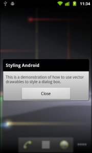
This now looks like this:

Next we’ll define a new drawable for the LinearLayout that we’ve just created in res/drawable/dialog_footer.xml:
This is has a solid grey fill with the bottom two corners rounded. Next we need to define a new style using this drawable, and adding some padding at the top which will balance the 5dp that will be added to the bottom because of the rounded corners:
We can apply this to the LinearLayout by setting its style attribute:
.
.
.
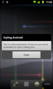
Which gives us:

Now let’s have a look at the button. As I have already mentioned, styling widgets is a little more complex than the styling that we’ve done thus far because widgets need to indicate visually when they have focus, are selected, are clicked, or are disabled.
It is worth a quick discussion about these various states because many of the problems which are encountered when styling controls are often the result of misunderstanding the widget state.
- Pressed – when a widget such as a button is clicked
- Focused – when the widget is highlighted via the D-pad or trackball
- Selected – when a widget is activated, such as the active tab on atab control
- Checkable – this is specific to widgets which can transition between a checkable and non-checkable state
- Checked – when a widget, such as a checkbox, is checked
- Enabled – when a widget is enabled
- Window Focused – when the lop level window containing the widget has focus.
There are some subtle differences between these states and it is easy to use the wrong one, and find that the behaviour that you’re expecting doesn’t happen!
Now that we have an understating of the various states that a widget can have, we can define a State List drawable which assigns different drawables for the widget depending on its state. Create this at res/drawable/button.xml:
When rendering a control each line of state drawable is evaluated until a match is found, and then that drawable is used. Therefore the order of entries is vital. In this case it is important the the “pressed” state is matched before the “focused” state. If these entries were swapped, then navigating to the control using the D-pad or trackball and then clicking would still match to focused. More common problems with state drawables result from getting the entries in the wrong order.
We now need to define the drawables that this references. First res/drawable/button_normal.xml:
This is a simple grey gradient with slightly rounded corners, and some padding around the text of the button.
Next res/drawable/button_focused.xml:
This is similar to button_normal, except that it draws a green border around the button when it has focus.
And finally res/drawable/button_focused.xml:
This uses a green gradient fill.
We now need to create a style called button in res/values/styles.xml:
