
In the previous article we got the project set up for our Text Clock app, and added the business logic code. In this article we’ll begin creating an App Widget that the user can add to their home page.
The first thing that we need to do to create an App Widget is to create an instance of AppWidgetProvider. For now we’ll keep this fairly simple:
public class TextClockAppWidget extends AppWidgetProvider
{
    private Context context = null;

    @Override
    public void onUpdate( Context context,
        AppWidgetManager appWidgetManager,
        int[] appWidgetIds )
    {
        this.context = context;
    }
}
This call will be called by the OS to manage our widget. At the moment we’re just storing a reference to a Context which we’ll require later on. AppWidgetProvider extends BroadcastReceiver so we need to declare it as such in the Manifest. However, because AppWidgetProvider is a specialised form of BroadcastReceiver, we need to provide some additional metadata which is specific to AppWidgetProvider in an XML file:
The appwidget_info file is as follows:
This file will be expanded in to an AppWidgetProviderInfo instance at runtime, but let’s look at the individual attributes:
minWidthandmaxWidth– These are the default dimension of the widget. For this app we’re going to create a widget which is two home screen cells wide by one cell high. A full explanation of these values can be found here.updatePeriodMillis– this is how often the OS will make a call to our AppWidgetProvider to update the widget. On the face of it, this should suit our needs to update the time of the widget. In reality, however, the maximum update rate using this mechanism is every thirty minutes, and a clock which only updates every thirty minutes is pretty useless. Therefore we’ll need to look at an alternate mechanism for updating the widget and we use a default value here.initialLayout– this is a default layout which will be used for the widget, and displayed automatically when the widget is added to the users’ home screen. We’ll look at the layout shortly.previewImage– on API 11 (Honeycomb 3.0) devices and later, a preview image can be added which will be shown in the widget picker. We’ll include a screen capture here. This will be ignored on pre-API 12 devices.resizeMode– beginning with API 12 (Honeycomb 3.1) it was possible to resize widgets. A fixed size widget is perfect for our needs, so we’ll stick with that. One again, this attribute will be ignored on pre-API 12 devices.
As we can probably guess from the initialLayout attribute we need to create a layout in res/layout/appwidget.xml:
Here we have defined a LinearLayout with a background (which we’ll define in a moment) which contains three TextView widgets to display the our text. We have set styles for each of these which we’ll look at shortly. What may be slightly confusing is why it is all wrapped inside a FrameLayout – isn’t it inefficient to wrap our LinearLayout inside a FrameLayout in this way? The reason that we need to do this is that the margin behaviour of app widgets changed in API 14 (Ice Cream Sandwich) where app widgets automatically get a margin added. In order to maintain uniformity across older and newer devices we need to compensate for this by applying a margin value for pre-API 14 devices. We do this by adding res/values/dimens.xml which contains the definition of @dimen/widget_margin:
    8dp
    22dp
This is fine for older devices where we need to manually apply the margin, but for API-14 and later devices the OS will apply the margin so we need to override this for newer devices by creating res/values-v14/dimens.xml which will be selected automatically by the OS is API 14+ devices:
0dp
The background for the LinearLayout is defined in res/drawable/widget_background.xml:
This defines a semi-transparent rectangle with rounded corners, and a thin “holo’ blue outline.
Finally we define the text styles in res/values/styles.xml:
Finally we need to define the colours used. While these colours are available baked in to the OS on devices which support holo, we’re going for backwards compatibility, so we’ll include them in res/values/colors.xml:
    #ff00ddff
    #ff33b5e5
We’ve crammed quite a lot here but much of it has been covered in much more depth in the past so we’ve skimmed through things a little.
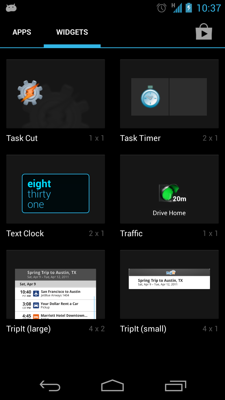
If we now have a look at where we are. If we install this and go to the widget selection page on our device we can see our widget listed, along with the preview image:
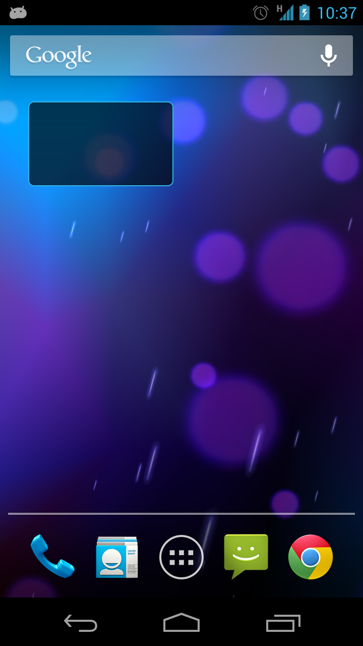
If we copy this on to our home page the widget background is displayed, but we currently aren’t actually displaying anything in the TextViews because we haven’t set the text yet:
In the next part of this series we’ll set this text to the current time.
The source code for this article can be found here, and TextClock is available from Google Play.
© 2013 – 2014, Mark Allison. All rights reserved.
Copyright © 2013 Styling Android. All Rights Reserved.
Information about how to reuse or republish this work may be available at http://blog.stylingandroid.com/license-information.

Excellent article as always, Mark.
One question regarding automatic padding by the framework since API 14:
If they are “padded”, why widget_margin was chosen as a dimen name for padding? I know you took the code from the docs, and naming could be irrelevant, but padding and margin are different things, as it’s explained clearly in figure 2 of http://developer.android.com/guide/practices/ui_guidelines/widget_design.html#anatomy.
Furthermore, these UI Guidelines state “As of Android 4.0, app widgets are automatically given margins between the widget frame and the app widget’s bounding box…” whereas the Dev Guide for appwidgets states “As of Android 4.0, app widgets are automatically given padding between…”.
You raise some good points, José.
The Google documentation is inconsistent. I agree with you that this is a “margin” rather than “padding”, so I have changed the article accordingly. The text that you quote from the Dev Guide actually has the title “Adding margins to App Widgets”, so I think that the use of the work “padding” within the text is actually an oversight. I used the dev guide as reference material, so copied the wrong naming convention in to my article.
Hopefully, it is all fixed now.
Thanks Mark. I’m not the only one who thought it was an inconsistency.
BTW, your FrameLayout still has android:padding=”@dimen/widget_margin”. Shouldn’t it be android:layout_marging=”@dimen/widget_margin”?
The thing to remember is that everything is wrapped in a single FrameLayout, and applying a padding on the FrameLayout will affect the layout of its children in precisely the same way as a layout_margin. And this is exactly how Google recommend doing it in the Dev Guide.
Bear in mind that this code is for a live app which has been tested and is functioning well across a variety of devices (including pre-API-14 ones). This particular series of articles is more about the process of getting apps ready for market, so making a change which will have no noticeable effect on the running app does not seem worth the effort of having to go through a new test and release cycle.
Ok, I got it.
Then these two XML will achieve the same result?
<LinearLayout …
———–
<LinearLayout …