
In January 2013 I published the first article in a series on developing a TextClock app widget, lockscreen widget, and Daydream. At the conclusion of that series it was mentioned that TextClock would be revisited, and in this series we’re going to look at some changes that can be made to add some polish, and also bring it up to date with the latest version of Android (4.4 Kitkat, at the time of writing).
One of the first things that we need to do is bring the colours in to line with the changes made in Kitkat where the default light blue highlight was changed to a more neutral white. Obviously we want to ensure that we provide the correct experience on different OS version, so we need to utilise Android resource management to use the correct colour scheme on different versions of Android.
Let’s start with looking at res/values/colors.xml:
    #ff00ddff
    #ff33b5e5
While this will work on versions of Android prior to the introduction of the holo theme, we wanted to at least use the holo colour scheme as a default.
To switch this to white on Kitkat and later, we simply need to add res/values-v19/colors.xml which will automatically get used when running on API 19 and later:
	#CDFFFFFF
	#ABFFFFFF
These names are a little misleading because the colour is no longer blue, but to save us having to alter all of the references to this, we have simply changed the value to a white colour to apply this change anywhere where this colour definition is referenced.
In order for this to work correctly, we have to modify our styles to always use the local definition of this colour value instead of the one in the android namespace. For example:
Must change to:
If we now run this on a Kitkat device, we can see the new colour scheme in place:
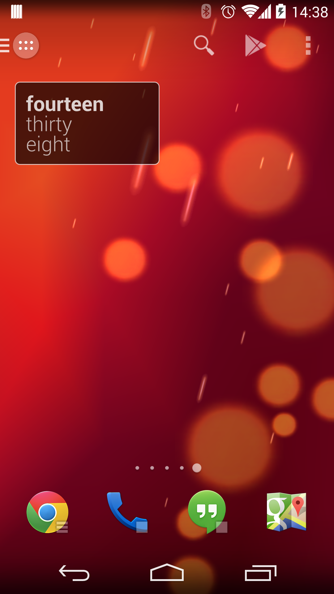
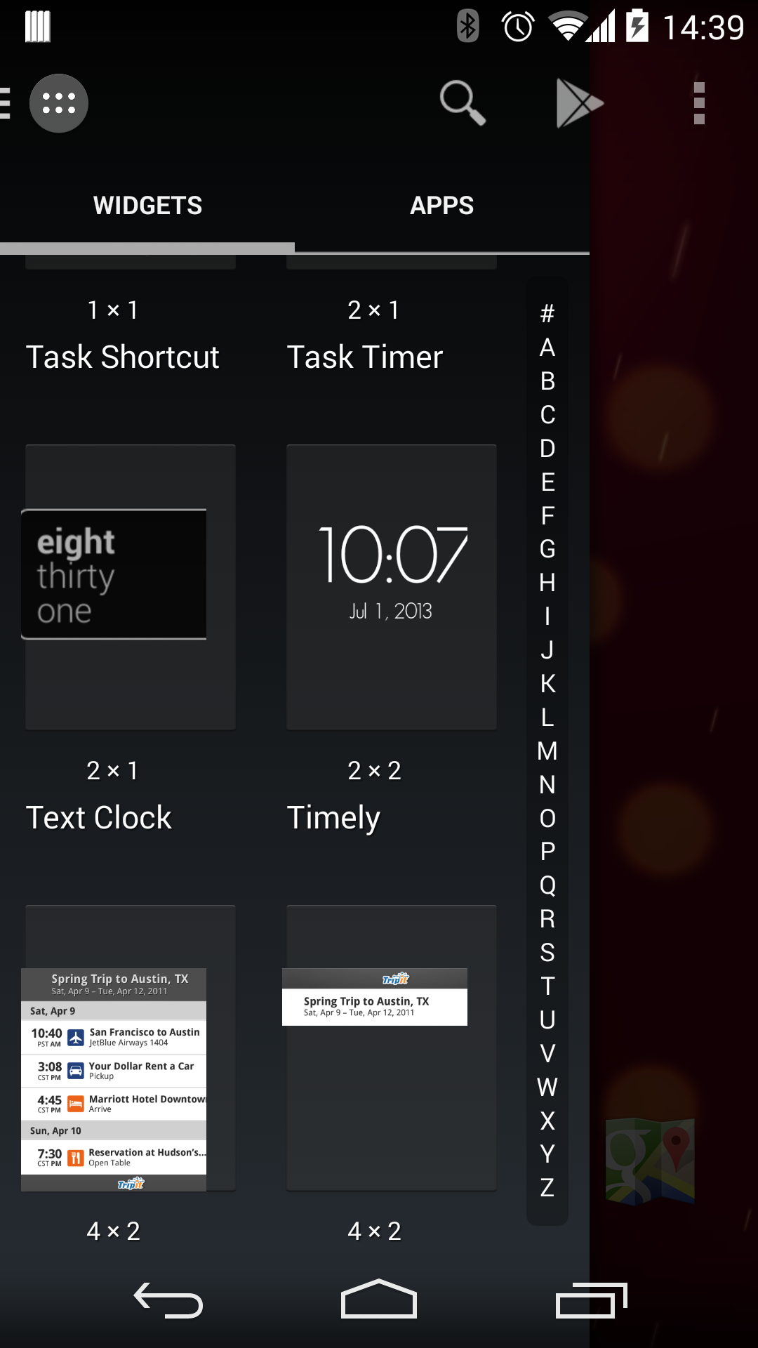
This may seem like all we need to do to change the colours, but there’s another subtle change that we need to make. In the our res/xml/appwidget_info.xml definition we provided a preview bitmap that gets presented to the user in the Android widget selector, and these images have the old colour scheme. Ideally we want to show the new colour scheme, but only on Kitkat and later devices.
Once again we can rely upon Android resource management to handle this for us, all we need to do is to provide alternative graphics and put these in the appropriate folders.
We currently have images named widget.png in res/drawable-mdpi, res/drawable-hdpi, and res/drawable-xhdpi. All that we need to do is provide versions of these with the Kitkat colour scheme an put these in the respective directories res/drawable-mdpi-v19, res/drawable-hdpi-v19, and res/drawable-xhdpi-v19. When we run this, the appropriate version for the OS level and screen density will automatically be selected.
Now when we run this we will see the correct colour scheme being displayed in the Android widget selector:
In the next article in this series we’ll have a look at applying some animations.
The source code for this article can be found here, and TextClock is available from Google Play. Version 2.0.0 has recently been published which contains the changes in this article, but there will be a number of minor updates over the coming weeks as we add additional functionality to the app.
© 2014, Mark Allison. All rights reserved.
Copyright © 2014 Styling Android. All Rights Reserved.
Information about how to reuse or republish this work may be available at http://blog.stylingandroid.com/license-information.

Can i update my gellybean 4.2.2 to kitkat?
Since the name is misleading on KitKat and above, why would you not override the style in values-v19 instead of overriding the color definition?
I know that it is more places to override, but it seems “cleaner”.