In part 2 we got our basic dialog box look and feel working, but still had some tidying up to do.
The first things that we need to do it to make the dialog box title look a bit more like a dialog box title. We need to define a new drawable for the background of the title in res/drawable/dialog_title.xml:
This is very similar to the previous shape drawable that we defined in part 2. The aspects worth highlighting are that we are using a solid fill rather than a gradient (line 4), and we are only rounding the top two corners (line 5).
Now that we have defined this, we need to apply the background to the “title” style:
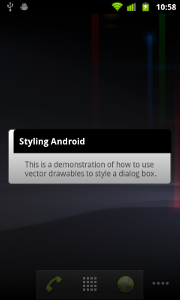
We assign the background drawable in line 5, and it now looks like this:

That’s pretty much done as far as the actual dialog box itself is concerned, however, it would be nicer if we could pull the sides of the dialog box in a little from the edge of the screen to further strengthen the visual metaphor of a floating dialog box. The simple way of doing this is to simply apply a margin to the “dialog” style:
This does what we want in putting a margin around the dialog box, but causes a problem with the title:

What is happening here is that the child objects are inheriting the margin settings from their parent. To fix this, we need to reset the margin for these child elements:
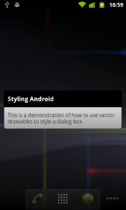
This is now looking complete:

However, there is another method of achieving the margin which is worth mentioning because it introduces us to another concept in vector drawables, and that is using an inset drawable. An inset drawable enables us to put a margin around an existing drawable. Let’s define an inset drawable at res/drawable/dialog.xml:
This is basically putting a wrapper around the existing dialog_background drawable, and insetting the left and right edges. To use this, we need to modify our styles slightly:
.
.
.
The main change here is on line 14 where we are using the dialog drawable instead of the dialog_background drawable. Also we have commented out the margins that we applied previously as we don’t want to apply the margin twice. Either method is fine, but it was worth showing that there are different ways of achieving the same result (as is often the case in Android).
The dialog box is now complete, it has some margins applied, and everything is looking good. The final thing worth showing is that it is possible to control how the background is changed. The default behaviour is for the background behind the dialog to be “dimmed” so that the dialog box stands out. However, we can change this behaviour so that the background is blurred instead. To do this, we actually need to do some Java coding for the first time in this article. The onCreate method of the MainActivity that was created by the New Android Project wizard in Eclipse looks like this:
@Override
public void onCreate(Bundle savedInstanceState)
{
	super.onCreate(savedInstanceState);
	setContentView(R.layout.main);
}
We can blur the background by adding a few lines of code:
@Override
public void onCreate(Bundle savedInstanceState)
{
	super.onCreate(savedInstanceState);
	setContentView(R.layout.main);
	WindowManager.LayoutParams lp = getWindow().getAttributes();
	lp.dimAmount = 0.0f;
	getWindow().setAttributes( lp );
	getWindow().addFlags( WindowManager.LayoutParams.FLAG_BLUR_BEHIND );
}
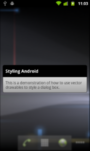
What we are doing here is getting the layout parameters for the window (line 6), overriding the “dimAmount” value to turn off the dimming (line 7), applies this back to the window (line 8), and finally sets the FLAG_BLUR_BEHIND flag on the window.
If we run this we’ll see the following:

That’s it! Hopefully this article has given some insight in to how vector drawables can be used to apply some simple but visually appealing styling to your Android apps. In the next article, we’ll have a look at state drawables which allow you to style individual widgets.
The source code for this article can be downloaded here.
© 2011 – 2014, Mark Allison. All rights reserved.
Copyright © 2011 Styling Android. All Rights Reserved.
Information about how to reuse or republish this work may be available at http://blog.stylingandroid.com/license-information.

great blog!!!
there any way to incorporate this directly to an alert dialog? rather than through an activity?
Yes there is. I’ll write an article on it, which should be published on 17th June.
Awesome! I just love your blog.
Blurring is deprecated 🙁
Taher,
I found this solved the problem:
http://stackoverflow.com/a/10381077