
One of the foundations of Material Design 2.0 is the ability to define shapes to reinforce the branding being applied to our apps. At first glance what we are able to control appears to be somewhat limited, but in this series we’ll go deeper down the rabbit hole to explore some of the more subtle things that we can do with material shape.

Previously we’ve looked at how we make effective use of Android themeing to apply a consistent shape identity across our app, and also some potential pitfalls that we can encounter along the way.
Much of the discussion so far has been with regard to altering the appearance of the corners of our Material Shapes, and although the two types of corners available to us may seem quite restrictive, then offer surprising possibilities because they can be applied independently to each corner. However, we can also change the behaviour of how the edges are rendered and this provides us with even more possibilities for customising our shapes.
Before we continue, it is worth a big up-front warning that we cannot control the edge rendering from XML – so if we want to go this route we have to start doing things in Kotlin. This means that we’ll have additional work to apply these customised shapes consistently across an entire app. That said, the kind of results that we can get from changing the edge rendering is probably not something that we’re going to want to use everywhere, but more in specific cases. Hence the exploration of it here.
Before we look at customising our edges, let’s first look at how we can programmatically achieve the corner specification that we’ve already achieved using XML. I’ve added another button to the layout with an id of @+id/custom, and we can control the corners by constructing a ShapeAppearanceModel and passing this to the constructor of a MaterialShapeDrawable:
class MainActivity : AppCompatActivity() {

    private lateinit var binding: ActivityMainBinding

    override fun onCreate(savedInstanceState: Bundle?) {
        super.onCreate(savedInstanceState)

        binding = ActivityMainBinding.inflate(layoutInflater)
        setContentView(binding.root)

        binding.custom.setShapeBackground()
    }

    private fun View.setShapeBackground() {
        val cornerSize = resources.getDimension(R.dimen.corner_size)
        background = MaterialShapeDrawable(
            ShapeAppearanceModel.builder()
                .setAllCornerSizes(cornerSize)
                .setTopLeftCorner(CutCornerTreatment())
                .build()
        ).apply {
            fillColor = ColorStateList.valueOf(getThemeColor(R.attr.colorPrimary))
        }
    }

    private fun getThemeColor(@AttrRes attrId: Int) =
        TypedValue().let { typedValue ->
            theme.resolveAttribute(attrId, typedValue, true)
            typedValue.data
        }
}
This MaterialShapeDrawable instance gets set as the background of the button.
The API of the ShapeAppearanceModel.Builder class is what is used internally to construct the ShapeAppearanceModel from XML and much of the behaviour that we’ve looked at in the XML examples previously in this series. As with the XML approach we can apply corner sizes and corner styles wither to all corners, or to specific corners. Here we are setting all corner sizes at once, while specifying CutCornerTreatment() to the top left corner. This is the same as the cut corner family that we saw in the XML examples, and there is also a RoundedCornerTreatment() that represents the rounded family. If we run this we get the following:
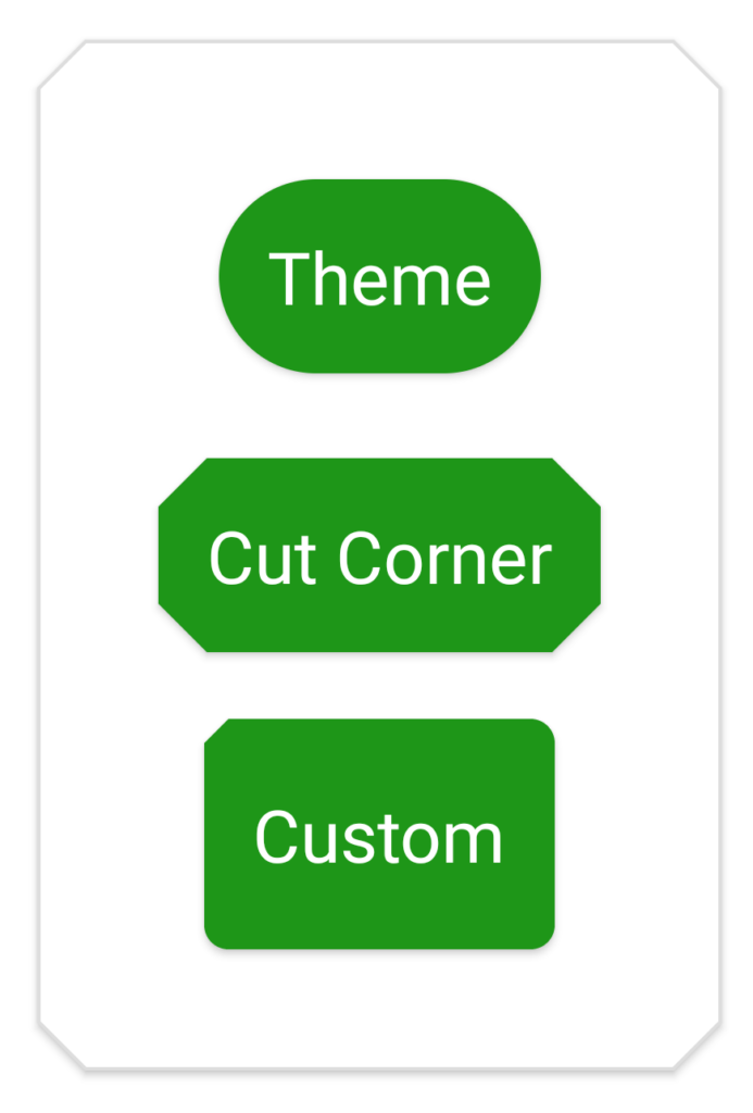
Although we’ve only specified a corner style for the top left corner, the rounded style for the other corners has been picked up from the default shape appearance that we defined in the theme previously, so we get rounded corners.
As has already been suggested, the ShapeAppearanceModel.Builder also allows us to create custom rendering for the edges of our shape. There are two edge treatments available: One is used internally by a CoordinatorLayout behaviour to provide a cutout in a bottom navigation bar to accommodate an overlapping FAB, and is of no value to other cases. But there is also TriangleEdgeTreatment which allows us to include either an inset our outset triangle in the middle of our edge.
We can apply these to the builder:
c    private fun View.setShapeBackground() {
        val cornerSize = resources.getDimension(R.dimen.corner_size)
        background = MaterialShapeDrawable(
            ShapeAppearanceModel.builder()
                .setAllCornerSizes(cornerSize)
                .setTopLeftCorner(CutCornerTreatment())
                .setTopEdge(TriangleEdgeTreatment(cornerSize, true))
                .setBottomEdge(TriangleEdgeTreatment(cornerSize, true))
                .setLeftEdge(TriangleEdgeTreatment(cornerSize, false))
                .setRightEdge(TriangleEdgeTreatment(cornerSize, false))
                .build()
        ).apply {
            fillColor = ColorStateList.valueOf(getThemeColor(R.attr.colorPrimary))
        }
    }
The first argument of the TriangleEdgeTreatment constructor is a size for the triangle, and the second is a boolean which controls whether the triangle is inset (true) or outset (false). Running this gives us:
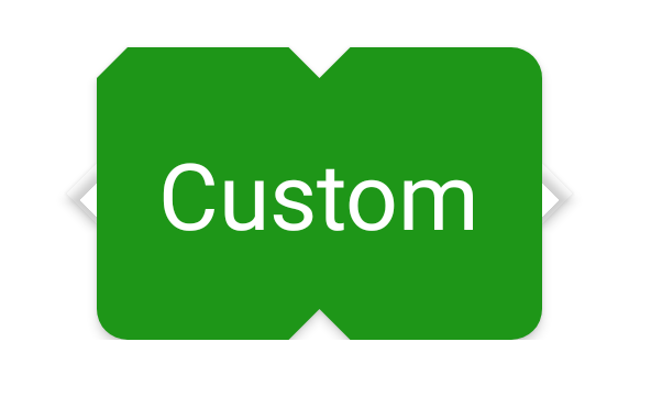
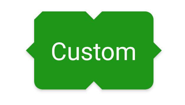
Houston we have a problem! While the inset triangles on the top and bottom edges are correct, there is an issue with the outset triangles on the left and right edges. The shadows for these are actually being rendered, but not the triangles themselves. The reason for this is that by default shapes are clipped to their bounds, and these outset triangles extend beyond the bounds of the button. We can fix this quite easily by setting an attribute on the parent layout: android:clipChildren="false" which turns off this clipping. Another useful ViewGroup attribute is android:clipToPadding which will clips any child Views to the padding of the parent layout. Sometimes this can cause issues if the shadow for a View extnds in to the padding area and gets clipped. Setting this attribute to false can resolve that.
With those attributes set we get:
This is actually fairly easy to achieve programmatically, but you may be wondering why this hasn’t been exposed to XML. There are actually a couple of reasons for this:
Firstly, the CornerTreatment classes have no arg constructors whereas the TriangleEdgeTreatment one has two arguments and these are specific to this edge treatment implementation. While it may seem that corner treatments also require an argument – the corner size – this is consistent across both corner types, so can easily be exposed via a styleable attribute. However the TriangleEdgeTreatment arguments are specific to it, and exposing these via a styleable attribute would make for a confusing XML API surface.
The second reason is that using custom edge treatments creates quite funky results, and having controls with fancy edges across the entire app would not make for a great experience, imo. Keeping the app’s shape identity confined to relatively simple shapes makes for a much nicer experience for the user. However there may be specific cases where we want something slightly different, and being able to provide custom edge styles on a case-by-case basis can be useful.
In the final article in this series we’ll go even deeper and look at how we can create custom treatments to give us even more control over our shapes.
The source code for this article is available here.
© 2020, Mark Allison. All rights reserved.
Copyright © 2020 Styling Android. All Rights Reserved.
Information about how to reuse or republish this work may be available at http://blog.stylingandroid.com/license-information.

SO F**KING AWESOME.
Thank you , This was very helpful !!